Carousel Slider in Flutter:In this article, you will learn how to create an image carousel from scratch and customize base on your need. In the end, you will learn how to use the carousel_slider plugin to create an image carousel with less code.
Carousel Slider is one of the most popular image slider used nowadays in most apps. These Carousel Sliders are mostly seen in various eCommerce sites such as Amazon, Flipkart, Myntra, and many more. Displaying the images in a slider gives an attractive User Experience. As these sliders are automate you can get to see various types of images and content in them.
Properties of Carousel Slider:
- Items: In which we have to declare Asset Images or Network Images that are use in our app
- Options: It consists of many properties such as:
- height: Overall height of card to display the image
- autoplay: Cards automatically slides at a time
- autoplaycurve: Determines the animation curve
- aspectRatio: Aspect Ratio is use to declare the height
- autoPlayAnimationDuration: Use to declare time for automated slide
Step 1: First add Carousel Slider dependency in pubspec.yaml file in the lib folder
We have added the dependency for Carousel Slider in our pubspec.yaml file located in the lib folder in dependencies as shown below:
Now click on pub.get to configure.
Step 2: Now navigate to main.dart() file and return Material App().
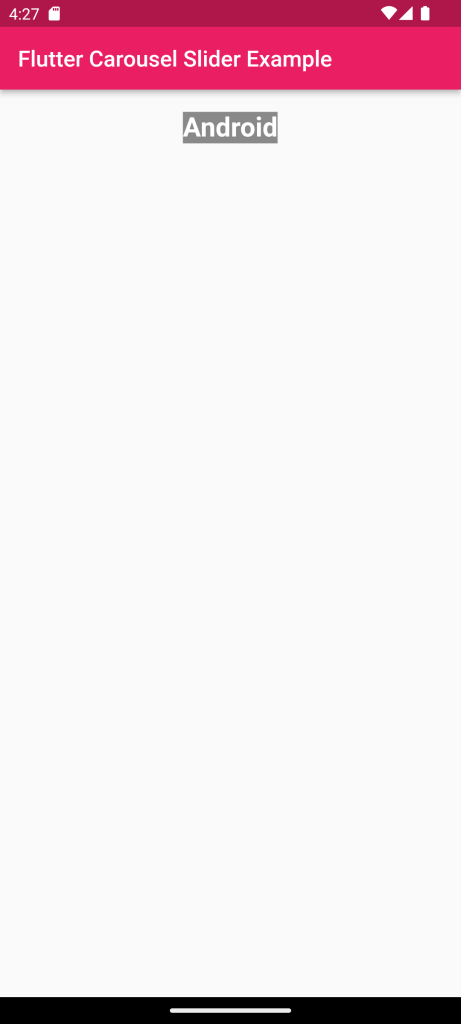
First, we have declared MyApp() in runApp in the main function. Then we have created StatelessWidget for MyApp in which we have return MaterialApp(). In this MaterialApp() we have given the title of our App then declare the theme of our App as Dark Theme. Then we have given our first screen of or slider app in the home: HomePage()
Sample Example:
import 'package:carousel_slider/carousel_slider.dart';
import 'package:flutter/material.dart';
void main() {
  runApp(MyApp());
}
class MyApp extends StatelessWidget {
  @override
  Widget build(BuildContext context) {
    return MaterialApp(
      title: 'Flutter Carousel Slider',
      debugShowCheckedModeBanner: false,
      home: Scaffold(
        appBar: AppBar(
          title: Text('Flutter Carousel Slider Example'),
        ),
        body: CarouselSlider(
          items: [
            Padding(
              padding: const EdgeInsets.all(20.0),
              child: Text('Android'),
            ),
            Padding(
              padding: const EdgeInsets.all(20.0),
              child: Text('iOS'),
            ),
            Padding(
              padding: const EdgeInsets.all(20.0),
              child: Text('Desktop'),
            ),
            Padding(
              padding: const EdgeInsets.all(20.0),
              child: Text('Web'),
            )
          ],
          options: CarouselOptions(
            autoPlay: true,
          ),
        ),
      ),
    );
  }
}
Flutter uses pubspec.yaml file, located at the root of your project, to identify assets required for the app.
If you save the pubspec.yaml file with the above lines of code it helpful to use the images that whatever images you save in assets file
For Example:
assets:
    - assets/images/
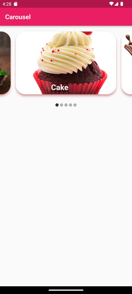
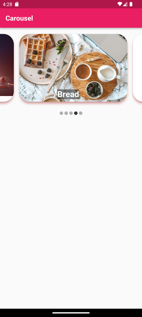
Full Code:Carousel Slider in Flutter
import 'package:flutter/material.dart';
import 'package:carousel_slider/carousel_slider.dart';

final List<String> imagesList = [
  'assets/images/cake.jpg',
  'assets/images/chocolate.jpg',
  'assets/images/ice.jpg',
  'assets/images/bread.jpg',
  'assets/images/rice.jpg'
];
final List<String> titles = [
  'Cake',
  'Chocolate',
  'Ice Cream ',
  'Bread ',
  'Rice'
];
void main() {
  runApp(MyApp());
}

class MyApp extends StatefulWidget {
  @override
  _MyAppState createState() => _MyAppState();
}

class _MyAppState extends State<MyApp> {
  int _currentIndex = 0;
  @override
  Widget build(BuildContext context) {
    return MaterialApp(
      debugShowCheckedModeBanner: false,
      home: Scaffold(
        appBar: AppBar(
          backgroundColor: Colors.pink,
          title: Text(
            'Carousel',
            style: TextStyle(fontSize: 20, fontWeight: FontWeight.bold),
          ),
        ),
        body: Column(
          children: [
            CarouselSlider(
              options: CarouselOptions(
                autoPlay: true,
                // enlargeCenterPage: true,
                //scrollDirection: Axis.vertical,
                onPageChanged: (index, reason) {
                  setState(
                    () {
                      _currentIndex = index;
                    },
                  );
                },
              ),
              items: imagesList
                  .map(
                    (item) => Padding(
                      padding: const EdgeInsets.all(8.0),
                      child: Card(
                        margin: EdgeInsets.only(
                          top: 10.0,
                          bottom: 10.0,
                        ),
                        elevation: 6.0,
                        shadowColor: Colors.redAccent,
                        shape: RoundedRectangleBorder(
                          borderRadius: BorderRadius.circular(30.0),
                        ),
                        child: ClipRRect(
                          borderRadius: BorderRadius.all(
                            Radius.circular(30.0),
                          ),
                          child: Stack(
                            children: <Widget>[
                              Image.asset(
                                item,
                                fit: BoxFit.cover,
                                width: double.infinity,
                              ),
                              Positioned(
                                top: 160,
                                left: 110,
                                child: Center(
                                  child: Text(
                                    '${titles[_currentIndex]}',
                                    style: TextStyle(
                                      fontSize: 24.0,
                                      fontWeight: FontWeight.bold,
                                      backgroundColor: Colors.black45,
                                      color: Colors.white,
                                    ),
                                  ),
                                ),
                              ),
                            ],
                          ),
                        ),
                      ),
                    ),
                  )
                  .toList(),
            ),
            Row(
              mainAxisAlignment: MainAxisAlignment.center,
              children: imagesList.map((urlOfItem) {
                int index = imagesList.indexOf(urlOfItem);
                return Container(
                  width: 10.0,
                  height: 10.0,
                  margin: EdgeInsets.symmetric(vertical: 10.0, horizontal: 2.0),
                  decoration: BoxDecoration(
                    shape: BoxShape.circle,
                    color: _currentIndex == index
                        ? Color.fromRGBO(0, 0, 0, 0.8)
                        : Color.fromRGBO(0, 0, 0, 0.3),
                  ),
                );
              }).toList(),
            )
          ],
        ),
      ),
    );
  }
}
For More: To know about Bottom Navigation and Tab bar in Flutter




Leave a Reply