
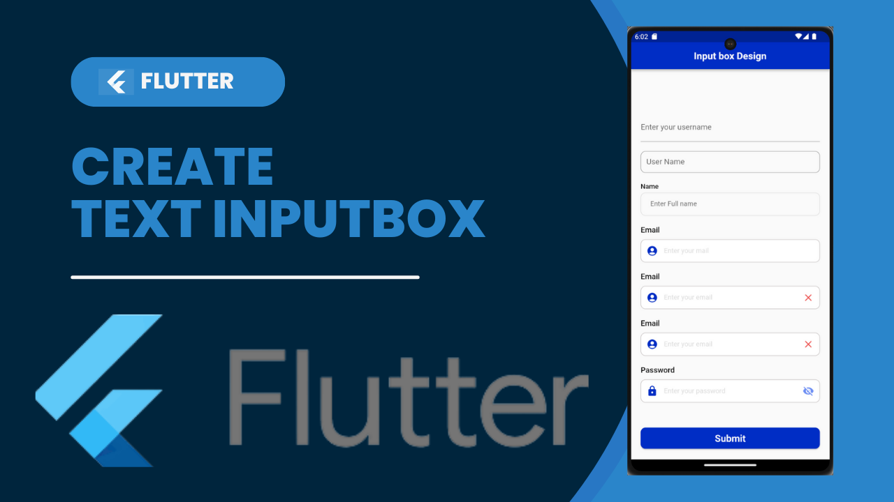
Text Input Box in Flutter:TextField in Flutter is the most commonly used text input widget that allows users to collect inputs from the keyboard into an app. We can use the TextField widget in building forms, sending messages, creating search experiences, and many more. By default, Flutter decorated the TextField with an underline. We can also add several attributes with TextField, such as label, icon, inline hint text, and error text using an InputDecoration as the decoration. If we want to remove the decoration properties entirely, it is required to set the decoration to null.
TextField:
A TextField or TextBox is an input element which holds the alphanumeric data, such as name, password, address, etc.
It can be single-line text field when only one line of information is required.
It can be multiple-line text field when more than one line of information is required.
TextField in Flutter is the most commonly used text input widget that allows users to collect inputs from the keyboard into an app.
We use the TextField widget in building forms, sending messages, creating search experiences, and many more.
By default, Flutter decorated the TextField with an underline.
We can also add several attributes with TextField, such as label, icon, inline hint text, and error text using an InputDecoration as the decoration.
Some of the most common attributes used with the TextField widget are as follows:
- decoration: It is use to show the decoration around TextField.
- border: It is use to create a default rounded rectangle border around TextField.
- labelText: It is use to show the label text on the selection of TextField.
- hintText: It is use to show the hint text inside TextField.
- icon: It is use to add icons directly to the TextField.
Create new project in Flutter
Step 1: Create a Flutter project in the IDE you used. Here, I am going to use VisualStudio.
Step 2: Open the project in Android Studio and navigate to the lib folder. In this folder, open the main.dart file and import the material.dart package as gives below:
import 'package:flutter/material.dart'; Step 3: Next, call the main MyApp class using void main run app function and then create your main widget class name as MyApp extends with StatefulWidget:
- void main() => runApp( MyApp() );
- class MyApp extends StatefulWidget { }
- Create a new subclass of StatefulWidget and its associate State subclass.
Type stf or stl in the ide to auto-import all the code necessary to write a stateful or stateless widget. When the shortcut is select, all the code appears with 5 cursors to name your new widget as you need.
class name extends StatefulWidget {
name({Key? key}) : super(key: key);
@override
State<name> createState() => _nameState();
}
class _nameState extends State<name> {
@override
Widget build(BuildContext context) {
return Container();
}
}
In that inside the container we used to start coding for the login page.
Replace Container() into Scaffold()
The scaffold is used to expand and to fill the available space. That usually means that it will occupy its entire window or device screen.
Body :
Its the primary content of the scaffold.
SingleChildScrollView ( )
A box in which a single widget can be scroll.
SingleChildScrollView widget is useful when you have a single box that will normally be entirely visible.
TextInput Field
TextFormField wraps a TextField and integrates it with a Form. This provides additional functionality, such as validation and integration with other Form widgets.
By default, a TextField is decorate with an underline. You can add a label, icon, inline hint text, and error text by supplying an InputDecoration as the decoration property of the TextField.
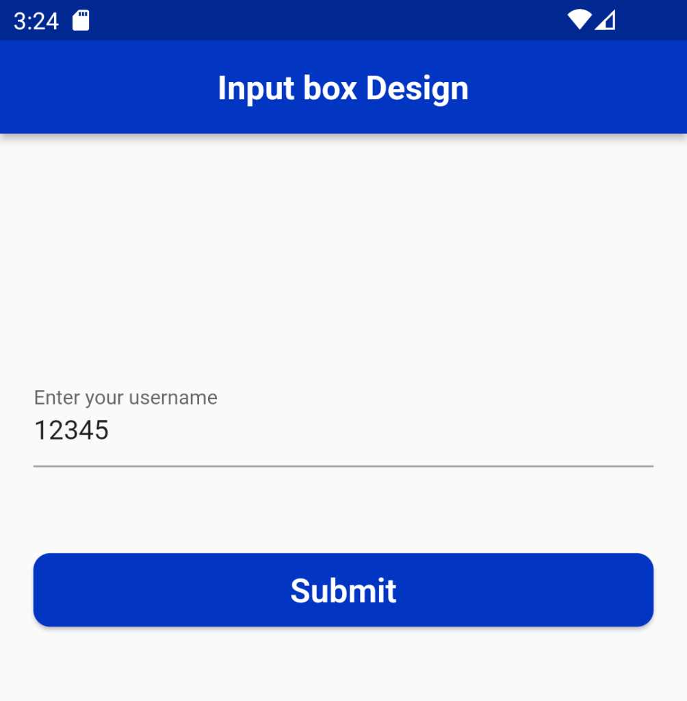
Type1: TextField UnderlineInputBorder
TextFormField(
  decoration: const InputDecoration(
    border: UnderlineInputBorder(),
    labelText: 'Enter your username',
  ),
 )
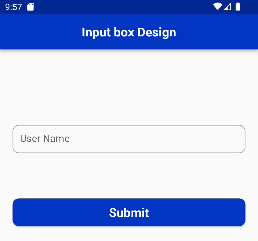
Type2: TextField OutlineInputBorder
TextField(
  decoration: InputDecoration(
    border: OutlineInputBorder(),
    labelText: 'User Name',
    hintText: 'Enter Your Name',
  ),
), 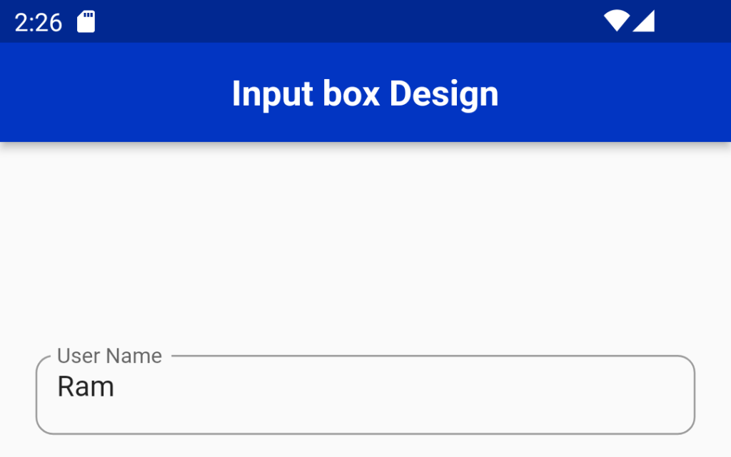
Type3: TextField enabledBorder and focusedBorder
TextFormField(
 controller: name,
 keyboardType: TextInputType.text,
 style: TextStyle(
     color: black,
     fontFamily: 'Rubik',
     fontSize: 14,
     fontWeight: FontWeight.w600),
 decoration: InputDecoration(
   enabledBorder: OutlineInputBorder(
       borderSide: const BorderSide(width: 1, color: grey),
       borderRadius: BorderRadius.circular(10)),
   focusedBorder: OutlineInputBorder(
       borderSide: const BorderSide(color: Blue, width: 2.5),
       borderRadius: BorderRadius.circular(10)),
   border: OutlineInputBorder(
       borderRadius: BorderRadius.circular(10),
       borderSide: BorderSide(color: Blue, width: 2)),
   contentPadding: const EdgeInsets.only(left: 20),
   hintText: 'Enter Full name',
   hintStyle: const TextStyle(
       fontSize: 14,
       fontWeight: FontWeight.w400,
       fontStyle: FontStyle.normal),
),
), 
Form with validation
1. Create a Form with a GlobalKey
2. Add a TextFormField with validation logic
3. Create a button to validate and submit the form
import 'package:flutter/material.dart';
class MyCustomForm extends StatefulWidget {
  const MyCustomForm({super.key});
  @override
  MyCustomFormState createState() {
    return MyCustomFormState();
  }
}
class MyCustomFormState extends State<MyCustomForm> {
   final _formKey = GlobalKey<FormState>();
  @override
  Widget build(BuildContext context) {
    return Form(
      key: _formKey,
      child: const Column(
        children: <Widget>[
         ],
      ),
    );
  }
} 
Retrieve the value of a TextField
Flutter allows the user to retrieve the text in mainly two ways: First is the onChanged method, and another is the controller method. Both are discuss below:
1. onChanged method: It is the easiest way to retrieve the text field value. This method store the current value in a simple variable and then use it in the TextField widget. Below is the sample example:
Syntax:
For Example:
String value = "";
TextField(
  onChanged: (text) {
    value = text;
  },
 )
TextFormField(
 keyboardType: TextInputType.emailAddress,
 validator: (String? value) {
   if (value!.isEmpty) {
      return "Please enter email";
   }
   return null;
 },
 onChanged: (value) {
   setState(() {
   isEmailCorrect1 = !(!RegExp(
          r"^[a-zA-Z0-9.a-zA-Z0-9.!#$%&'*+-/=?^_`{|}~]+@[a-zA-Z0-9]+\.[a-zAZ]+").hasMatch(value));
   });
 },
 controller: email2,
 autocorrect: true,
 decoration: InputDecoration(
     border: OutlineInputBorder(
         borderRadius: BorderRadius.circular(10),
         borderSide: BorderSide(color: Blue, width: 2)),
     enabledBorder: OutlineInputBorder(
         borderRadius: BorderRadius.circular(10),
         borderSide: const BorderSide(color: box),
     ),
     focusedBorder: OutlineInputBorder(
         borderRadius: BorderRadius.circular(10),
         borderSide: BorderSide(
             color: isEmailCorrect1 == false ? red : green,width: 2),
     ),
     contentPadding: const EdgeInsets.only( left: 24, top: 14, bottom: 13),
     filled: true,
     fillColor: Colors.white,
     hintText: "Enter your email",
     hintStyle: const TextStyle(color: grey, fontSize: 14),
     prefixIcon: Icon(
       Icons.account_circle,
       color: Blue,
     ),
     suffixIcon: isEmailCorrect1 == false
        ? Icon(
            Icons.close_sharp,
            color: red,
          )
        : Icon(
            Icons.done,
            color: green,
          )),
),

2. Controller method: It is a popular method to retrieve text field value using TextEditingController. It will be attached to the TextField widget and then listen to change and control the widget’s text value. Below is the sample code:
Validate the TextField:
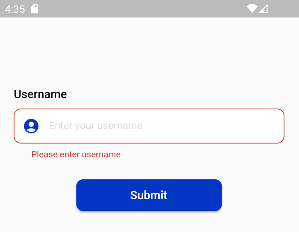
The TextFormField widget renders a material design text field and can display validation errors when they occur.
Validate the input by providing a validator() function to the TextFormField. If the user’s input isn’t valid, the validator function returns a String containing an error message. If there are no errors, the validator must return null.
TextFormField(
  validator: (value) {
    if (value == null || value.isEmpty) {
      return 'Please enter some text';
    }
    return null;
  },
),
validate and submit the form:
A form with a text field, provide a button that the user can tap to submit the information.
When the user attempts to submit the form, check if the form is valid. If it is, display a success message. If it isn’t (the text field has no content) display the error message.
ElevatedButton(
  onPressed: () {
       if (_formKey.currentState!.validate()) {
           ScaffoldMessenger.of(context).showSnackBar(
        const SnackBar(content: Text('Processing Data')),
      );
    }
  },
  child: const Text('Submit'),
),
TextFormField(
keyboardType: TextInputType.emailAddress,
validator: (String? value) {
if (value!.isEmpty) {
return "Please enter email";
}
return null;
},
onChanged: (value) {
setState(() {
isEmailCorrect = !(!RegExp(
r"^[a-zA-Z0-9.a-zA-Z0-9.!#$%&'*+-/=?^_`{|}~]+@[a-zA-Z0-9]+\.[a-zA-Z]+")
.hasMatch(value));
});
},
controller: email,
autocorrect: true,
decoration: InputDecoration(
border: OutlineInputBorder(
borderRadius: BorderRadius.circular(10),
borderSide: BorderSide(color: Blue, width: 2)),
enabledBorder: OutlineInputBorder(
borderRadius: BorderRadius.circular(10),
borderSide: const BorderSide(color: box),
),
focusedBorder: OutlineInputBorder(
borderRadius: BorderRadius.circular(10),
borderSide: BorderSide(
color: isEmailCorrect == false ? red : Blue, width: 2),
),
contentPadding:
const EdgeInsets.only(left: 24, top: 14, bottom: 13),
filled: true,
fillColor: Colors.white,
hintText: "Enter your email",
hintStyle: const TextStyle(color: grey, fontSize: 14),
prefixIcon: Icon(
Icons.account_circle,
color: Blue,
),
),
), 
Decoration
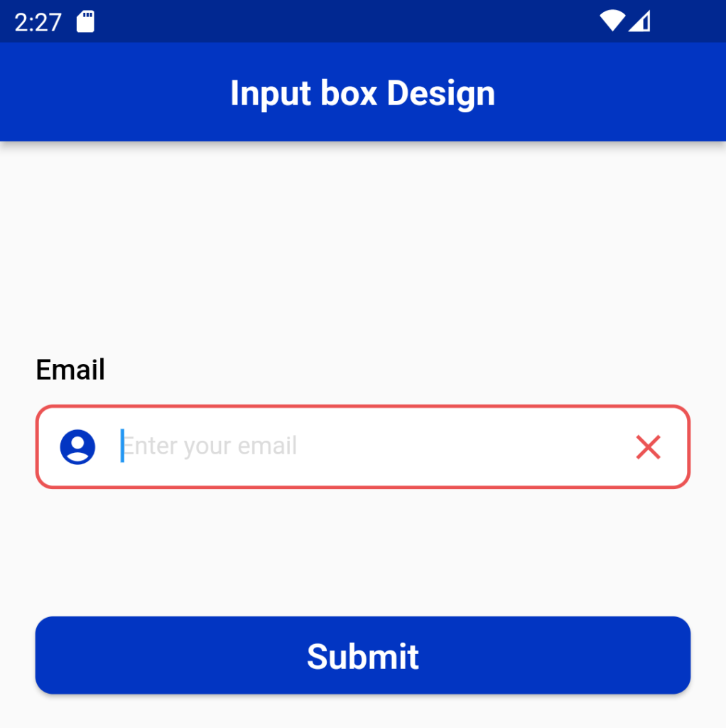
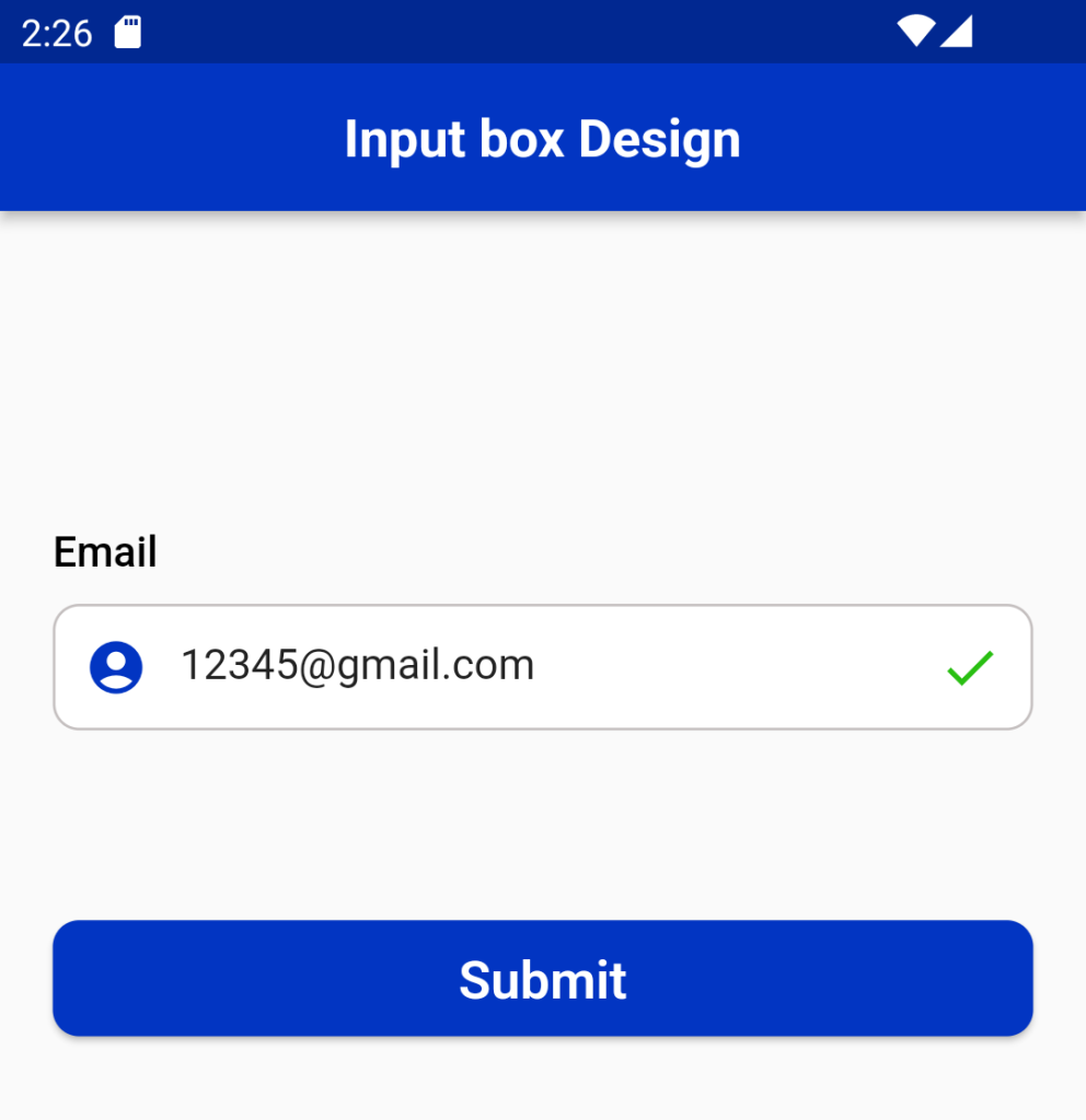
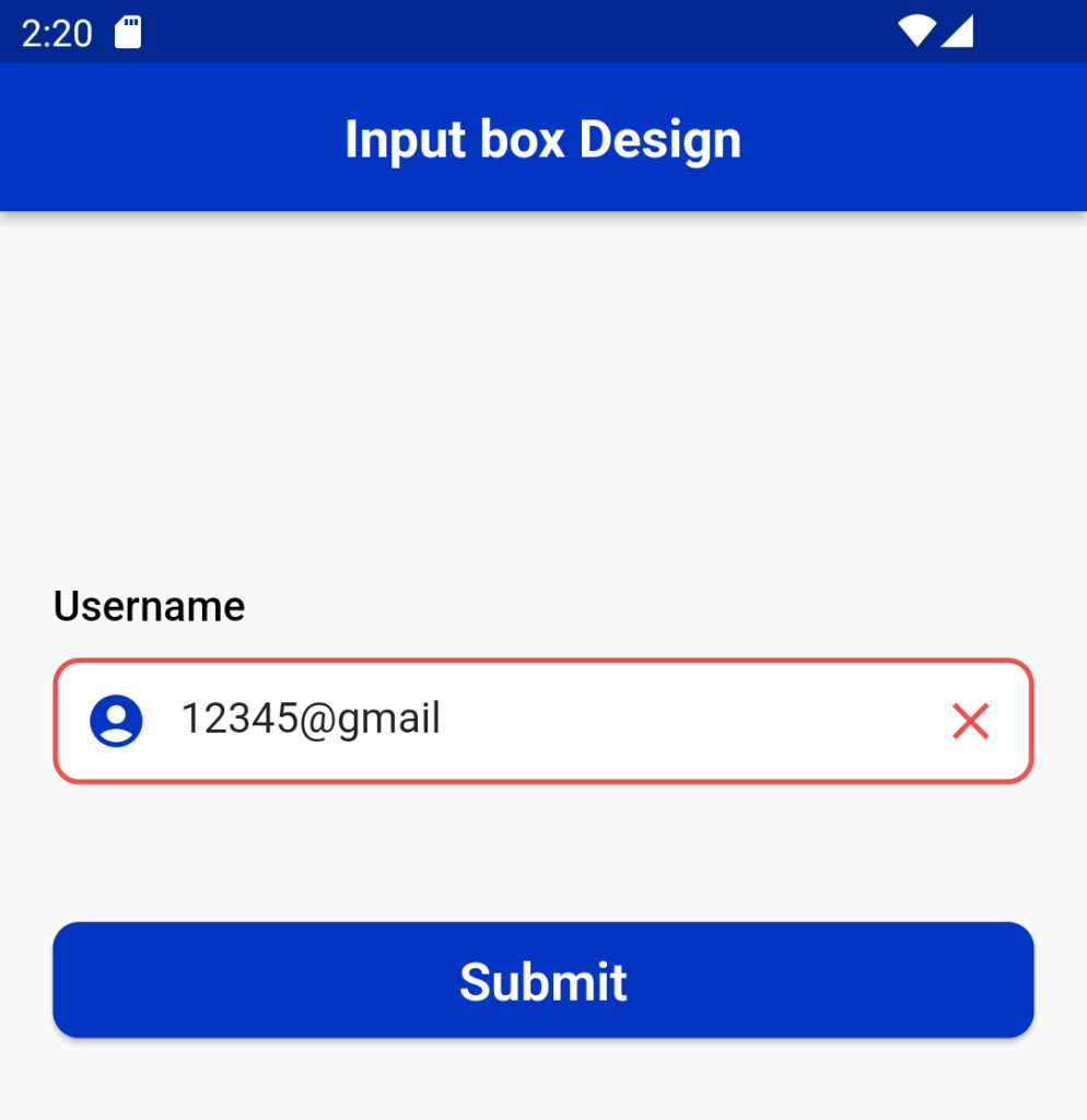
We can decorate the text field using the Input Decoration, Also we can give the prefix and suffix icons in the decoration.
Perfix
An icon that appears before the prefix or prefixText and before the editable part of the text field, within the decoration’s container.
The size and color of the prefix icon is configure automatically using an IconTheme and therefore does not need to be explicitly given in the icon widget.
The prefix icon is constrain with a minimum size of 48px by 48px, but can be expand beyond that. Anything larger than 24px will require additional padding to ensure it matches the Material Design spec of 12px padding between the left edge of the input and leading edge of the prefix icon.
prefixIcon: Padding(
padding: const EdgeInsetsDirectional.only(start: 12.0),
child: _myIcon,
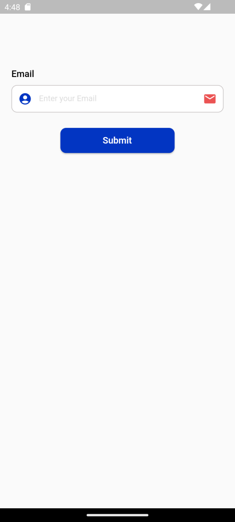
)Suffix
As same as the prefix the suffix icons also appear .
suffixIcon: Padding(
 padding: const EdgeInsetsDirectional.only(end: 12.0),
 child: _myIcon
 )
TextFormField(
keyboardType: TextInputType.emailAddress,
validator: (String? value) {
if (value!.isEmpty) {
return "Please enter email";
}
return null;
},
onChanged: (value) {
setState(() {
isEmailCorrect = !(!RegExp(
r"^[a-zA-Z0-9.a-zA-Z0-9.!#$%&'*+-/=?^_`{|}~]+@[a-zA-Z0-9]+\.[a-zA-Z]+")
.hasMatch(value));
});
},
controller: email,
autocorrect: true,
decoration: InputDecoration(
border: OutlineInputBorder(
borderRadius: BorderRadius.circul ar(10),
borderSide: BorderSide(color: Blue, width: 2)),
enabledBorder: OutlineInputBorder(
borderRadius: BorderRadius.circular(10), -c
borderSide: const BorderSide(color: box),
),
focusedBorder: OutlineInputBorder(
borderRadius: BorderRadius.circular(10),
borderSide: BorderSide(
color: isEmailCorrect == false ? red : Blue,
width: 2),
),
contentPadding:
const EdgeInsets.only(left: 24, top: 14, bottom: 13),
filled: true,
fillColor: Colors.white,
hintText: "Enter your Email",
hintStyle: const TextStyle(color: grey, fontSize: 14),
prefixIcon: Icon(
Icons.account_circle,
color: Blue,
),
suffixIcon: Icon(
Icons.mail,
color: red,
)),
), 
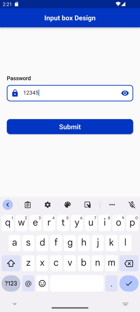
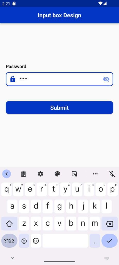
Visibility: Text Input Box in Flutter
The Visibility widget is to show and hide the widget. The Visibility widget has a property called visible. It accepts a boolean value. Setting the True will show the widget while setting it to false will hide the widget.
In the following example we use the visibility widget for password textfield .
TextFormField(
  validator: (String? value) {
    if (value!.isEmpty) {
      return "Please enter password";
    }
    return null;
  },
  controller: pass,
  autocorrect: true,
  obscureText: _passVisibility,
  decoration: InputDecoration(
      border: OutlineInputBorder(
          borderRadius: BorderRadius.circular(10),
          borderSide: BorderSide(color: red, width: 2)),
      enabledBorder: OutlineInputBorder(
          borderRadius: BorderRadius.circular(10),
          borderSide: const BorderSide(color: box),
      ),
      focusedBorder: OutlineInputBorder(
        borderRadius: BorderRadius.circular(10),
        borderSide: const BorderSide(color: Blue, width: 2),
      ),
      contentPadding: const EdgeInsets.only(left: 24, top: 14, bottom: 13),
      filled: true,
      fillColor: Colors.white,
      hintText: 'Enter your password',
      hintStyle: const TextStyle( color: grey, fontSize: 14),
      suffixIcon: IconButton(
        color: grey,
        icon: _passVisibility
            ? Icon(
                Icons.visibility_off,
                color: LiteBlue,
             )
            : Icon(
                Icons.visibility,
                color: Blue,
             ),
        onPressed: () {
          _passVisibility = !_passVisibility;
          setState(() {});
        },
      ),
      prefixIcon: Icon(
        Icons.lock_rounded,
        color: Blue,
      )),
), 
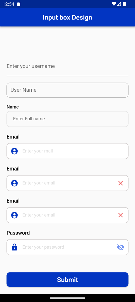
Full Code:Text Input Box in Flutter
import 'package:demoproject/Constant/color.dart';
import 'package:flutter/material.dart';
class TextInput extends StatefulWidget {
TextInput({Key? key}) : super(key: key);
@override
State<TextInput> createState() => _TextInputState();
}
class _TextInputState extends State<TextInput> {
final GlobalKey<FormState> formkey = GlobalKey<FormState>();
bool isloading = false;
bool _passVisibility = true;
bool isEmailCorrect = false;
bool isEmailCorrect1 = false;
TextEditingController name = TextEditingController();
TextEditingController email = TextEditingController();
TextEditingController email1 = TextEditingController();
TextEditingController email2 = TextEditingController();
TextEditingController pass = TextEditingController();
@override
Widget build(BuildContext context) {
return Scaffold(
appBar: AppBar(
backgroundColor: Blue,
title: Center(
child: Text(
"Input box Design",
style: TextStyle(fontSize: 20, fontWeight: FontWeight.bold),
)),
),
body: SingleChildScrollView(
child: SafeArea(
child: Container(
margin: EdgeInsets.only(top: 100),
child: Padding(
padding: const EdgeInsets.all(20),
child: Column(
crossAxisAlignment: CrossAxisAlignment.start,
children: [
TextFormField(
decoration: const InputDecoration(
border: UnderlineInputBorder(),
labelText: 'Enter your username',
),
),
SizedBox(
height: 20,
),
SizedBox(
height: 45,
width: 380,
child: TextField(
decoration: InputDecoration(
border: OutlineInputBorder(
borderRadius: BorderRadius.circular(10)),
labelText: 'User Name',
hintText: 'Enter Your Name',
),
),
),
SizedBox(
height: 20,
),
Text(
'Name',
style: TextStyle(
color: black,
fontSize: 14,
fontWeight: FontWeight.w500,
),
),
SizedBox(
height: 5,
),
TextFormField(
controller: name,
keyboardType: TextInputType.text,
validator: (String? value) {
if (value!.isEmpty) {
return "Please enter fullname";
}
return null;
},
onSaved: (name) {
name = name!;
},
style: TextStyle(
color: black,
fontFamily: 'Rubik',
fontSize: 14,
fontWeight: FontWeight.w600),
decoration: InputDecoration(
enabledBorder: OutlineInputBorder(
borderSide: const BorderSide(width: 1, color: grey),
borderRadius: BorderRadius.circular(10)),
focusedBorder: OutlineInputBorder(
borderSide: const BorderSide(color: Blue, width: 2.5),
borderRadius: BorderRadius.circular(10)),
border: OutlineInputBorder(
borderRadius: BorderRadius.circular(10),
borderSide: BorderSide(color: Blue, width: 2)),
contentPadding: const EdgeInsets.only(left: 20),
hintText: 'Enter Full name',
hintStyle: const TextStyle(
fontSize: 14,
fontWeight: FontWeight.w400,
fontStyle: FontStyle.normal),
),
),
SizedBox(
height: 20,
),
Text(
'Email',
style: TextStyle(
fontSize: 16,
fontWeight: FontWeight.w500,
color: Colors.black),
),
SizedBox(
height: 10,
),
TextFormField(
keyboardType: TextInputType.emailAddress,
validator: (String? value) {
if (value!.isEmpty) {
return "Please enter username";
}
return null;
},
controller: email,
autocorrect: true,
decoration: InputDecoration(
border: OutlineInputBorder(
borderRadius: BorderRadius.circular(10),
borderSide: BorderSide(color: Blue, width: 2)),
enabledBorder: OutlineInputBorder(
borderRadius: BorderRadius.circular(10),
borderSide: const BorderSide(color: box),
),
focusedBorder: OutlineInputBorder(
borderRadius: BorderRadius.circular(10),
borderSide: const BorderSide(color: Blue, width: 2),
),
contentPadding: const EdgeInsets.only(
left: 24, top: 14, bottom: 13),
filled: true,
fillColor: Colors.white,
hintText: "Enter your mail",
hintStyle: const TextStyle(
color: grey, fontFamily: 'Rubik', fontSize: 14),
prefixIcon: Icon(
Icons.account_circle,
color: Blue,
)),
),
SizedBox(
height: 20,
),
Text(
'Email',
style: TextStyle(
fontSize: 16,
fontWeight: FontWeight.w500,
color: Colors.black),
),
SizedBox(
height: 10,
),
TextFormField(
keyboardType: TextInputType.emailAddress,
validator: (String? value) {
if (value!.isEmpty) {
return "Please enter email";
}
return null;
},
onChanged: (value) {
setState(() {
isEmailCorrect = !(!RegExp(
r"^[a-zA-Z0-9.a-zA-Z0-9.!#$%&'*+-/=?^_`{|}~]+@[a-zA-Z0-9]+\.[a-zA-Z]+")
.hasMatch(value));
});
},
controller: email1,
autocorrect: true,
decoration: InputDecoration(
border: OutlineInputBorder(
borderRadius: BorderRadius.circular(10),
borderSide: BorderSide(color: Blue, width: 2)),
enabledBorder: OutlineInputBorder(
borderRadius: BorderRadius.circular(10),
borderSide: const BorderSide(color: box),
),
focusedBorder: OutlineInputBorder(
borderRadius: BorderRadius.circular(10),
borderSide: BorderSide(
color: isEmailCorrect == false ? red : Blue,
width: 2),
),
contentPadding: const EdgeInsets.only(
left: 24, top: 14, bottom: 13),
filled: true,
fillColor: Colors.white,
hintText: "Enter your email",
hintStyle: const TextStyle(color: grey, fontSize: 14),
prefixIcon: Icon(
Icons.account_circle,
color: Blue,
),
suffixIcon: isEmailCorrect == false
? Icon(
Icons.close_sharp,
color: red,
)
: Icon(
Icons.done,
color: green,
)),
),
SizedBox(
height: 20,
),
Text(
'Email',
style: TextStyle(
fontSize: 16,
fontWeight: FontWeight.w500,
color: Colors.black),
),
SizedBox(
height: 10,
),
TextFormField(
keyboardType: TextInputType.emailAddress,
validator: (String? value) {
if (value!.isEmpty) {
return "Please enter email";
}
return null;
},
onChanged: (value) {
setState(() {
isEmailCorrect1 = !(!RegExp(
r"^[a-zA-Z0-9.a-zA-Z0-9.!#$%&'*+-/=?^_`{|}~]+@[a-zA-Z0-9]+\.[a-zA-Z]+")
.hasMatch(value));
});
},
controller: email2,
autocorrect: true,
decoration: InputDecoration(
border: OutlineInputBorder(
borderRadius: BorderRadius.circular(10),
borderSide: BorderSide(color: Blue, width: 2)),
enabledBorder: OutlineInputBorder(
borderRadius: BorderRadius.circular(10),
borderSide: const BorderSide(color: box),
),
focusedBorder: OutlineInputBorder(
borderRadius: BorderRadius.circular(10),
borderSide: BorderSide(
color: isEmailCorrect1 == false ? red : green,
width: 2),
),
contentPadding: const EdgeInsets.only(
left: 24, top: 14, bottom: 13),
filled: true,
fillColor: Colors.white,
hintText: "Enter your email",
hintStyle: const TextStyle(color: grey, fontSize: 14),
prefixIcon: Icon(
Icons.account_circle,
color: Blue,
),
suffixIcon: isEmailCorrect1 == false
? Icon(
Icons.close_sharp,
color: red,
)
: Icon(
Icons.done,
color: green,
)),
),
SizedBox(
height: 20,
),
Text(
'Password',
style: TextStyle(
fontSize: 16,
fontWeight: FontWeight.w500,
color: Colors.black),
),
SizedBox(
height: 10,
),
TextFormField(
validator: (String? value) {
if (value!.isEmpty) {
return "Please enter password";
}
return null;
},
controller: pass,
autocorrect: true,
obscureText: _passVisibility,
decoration: InputDecoration(
border: OutlineInputBorder(
borderRadius: BorderRadius.circular(10),
borderSide: BorderSide(color: red, width: 2)),
enabledBorder: OutlineInputBorder(
borderRadius: BorderRadius.circular(10),
borderSide: const BorderSide(color: box),
),
focusedBorder: OutlineInputBorder(
borderRadius: BorderRadius.circular(10),
borderSide: const BorderSide(color: Blue, width: 2),
),
contentPadding: const EdgeInsets.only(
left: 24, top: 14, bottom: 13),
filled: true,
fillColor: Colors.white,
hintText: 'Enter your password',
hintStyle: const TextStyle(
fontFamily: 'Rubik', color: grey, fontSize: 14),
suffixIcon: IconButton(
color: grey,
icon: _passVisibility
? Icon(
Icons.visibility_off,
color: LiteBlue,
)
: Icon(
Icons.visibility,
color: Blue,
),
onPressed: () {
_passVisibility = !_passVisibility;
setState(() {});
},
),
prefixIcon: Icon(
Icons.lock_rounded,
color: Blue,
)),
),
SizedBox(height: 50),
Center(
child: SizedBox(
//width: 200,
child: ElevatedButton(
style: ElevatedButton.styleFrom(
shape: RoundedRectangleBorder(
borderRadius: BorderRadius.circular(10)),
backgroundColor: Blue,
minimumSize: const Size.fromHeight(44),
),
onPressed: () {
setState(() {
if (formkey.currentState!.validate()) {
isloading = true;
print(isloading);
}
});
},
child: isloading == true
? Container(
width: 24,
height: 24,
padding: const EdgeInsets.all(2.0),
child: const CircularProgressIndicator(
color: Colors.white,
strokeWidth: 3,
),
)
: Text(
'Submit',
style: TextStyle(
fontSize: 20,
fontFamily: 'IBMPlexSans',
fontWeight: FontWeight.w600,
),
),
),
),
),
],
),
),
)),
));
}
}
For More : To know about ListTile and Listview in Flutter


Leave a Reply