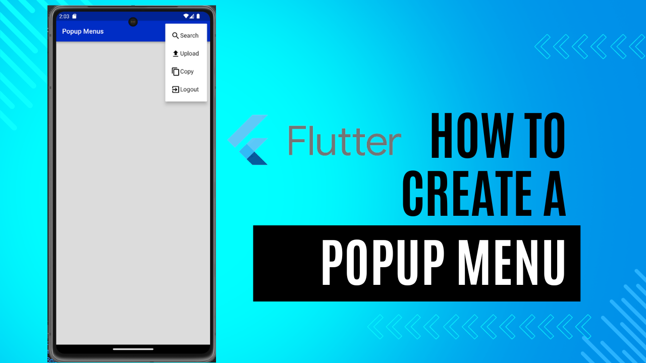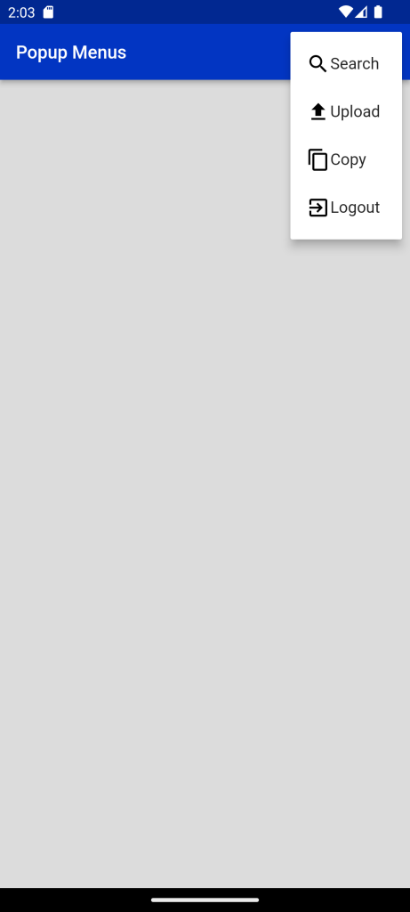
Popup Menu in Flutter:Popup menus are one of the most used widgets that display a menu when pressed and calls onselected when the menu is dismissed because an item was selected. Think of it as when you right-click your mouse, you see a list of menu items such as view, sort by, refresh, and …
Let’s deep dive into each parameter of the constructor.
key: It uniquely identifies specific widgets within in the collection. Rarely used in Popup menu constructor.
itemBuilder: creates the item to show in the menu.
initialValue: Makes sure that the item is highlight when you open the menu. Make sure to provide it inside Menu Item as well.
onSelected: Called when user selects value from the popup menu button.
onCanceled: Called when user dismiss the popup menu without selecting the item.
tooltip: Text that describes the action that will occur when the menu item is long press.
elevation: Controls the size of the shadow behind the menu.
padding: Sets the padding of the menu item. Useful to be able to set the padding to zero.
child: If provided, child is the widget used for this button and the button will utilize an Inkwell for taps.
offset: Useful property when you want to display menu at a particular position. Will be discuss later.
color: Provides the background color for the Popup Menu.
shape: Used to provide specific shape to our popup menu.
Code For Normal Popup:
_buildAppBar() {
    return AppBar(
      title: const Text(
        'Popup Menus',
        style: TextStyle(color: Colors.white, fontSize: 16.0),
      ),
      actions: [
        PopupMenuButton(
          itemBuilder: (ctx) => [
            _buildPopupMenuItem('Search'),
            _buildPopupMenuItem('Upload'),
            _buildPopupMenuItem('Copy'),
            _buildPopupMenuItem('Exit'),
          ],
        )
      ],
    );
  }

  PopupMenuItem _buildPopupMenuItem(
      String title) {
    return PopupMenuItem(
      child:  Text(title),
    );
  }
I have created a method named _buildAppBar() that constructs a basic appbar with action as a PopupMenuButton which consist of itembuilder property that defines how to build a single menu item which is defined below in the _buildPopupMenuItem() method.
The child property inside a PopupMenuItem can be any widget. Suppose we want to have an icon and text widget as a menu item,
We can change the background color of PopupMenuButton by adding a property called color as well as we can do a hell lot of other customizations as discussed above.
If we want to perform a particular action on click of a particular MenuItem, we have to supply an additional argument named value inside PopupMenuItem and adjust according to our needs.
Here what we have done is that we have added a property name onSelected inside the PopumenuButton that executes a method _onMenuItemSelected() inside of which we have changed the value of the variable named _changeColorAccordingToMenuItem. Also, don’t forget to pass the value argument into the _buildPopupMenuItem() method.
For differentation for the popup Screens
use the following code for screen background color
 _onMenuItemSelected(int value) {
    setState(() {
      _popupMenuItemIndex = value;
    });

    if (value == Options.search.index) {
      _changeColorAccordingToMenuItem = yellow;
    } else if (value == Options.upload.index) {
      _changeColorAccordingToMenuItem = grey;
    } else if (value == Options.copy.index) {
      _changeColorAccordingToMenuItem = violet;
    } else {
      _changeColorAccordingToMenuItem = primary;
    }
  }
Full Code:Popup Menu in Flutter
import 'package:demoproject/Constant/color.dart';
import 'package:flutter/material.dart';
import 'package:flutter/widgets.dart';

enum Options { search, upload, copy, exit }

class PopMenu extends StatefulWidget {
  PopMenu({Key? key}) : super(key: key);

  @override
  State<PopMenu> createState() => _PopMenuState();
}

class _PopMenuState extends State<PopMenu> {
  var _popupMenuItemIndex = 0;
  Color _changeColorAccordingToMenuItem = Colors.red;

  _buildAppBar() {
    return AppBar(
      backgroundColor: Blue,
      title: const Text(
        'Popup Menus',
        style: TextStyle(color: Colors.white, fontSize: 18),
      ),
      actions: [
        PopupMenuButton(
          onSelected: (value) {
            _onMenuItemSelected(value as int);
          },
          itemBuilder: (ctx) => [
            _buildPopupMenuItem('Search', Icons.search, Options.search.index),
            _buildPopupMenuItem('Upload', Icons.upload, Options.upload.index),
            _buildPopupMenuItem('Copy', Icons.copy, Options.copy.index),
            _buildPopupMenuItem(
                'Logout', Icons.exit_to_app, Options.exit.index),
          ],
        )
      ],
    );
  }

  PopupMenuItem _buildPopupMenuItem(
      String title, IconData iconData, int position) {
    return PopupMenuItem(
      value: position,
      child: Row(
        children: [
          Icon(
            iconData,
            color: Colors.black,
          ),
          Text(title),
        ],
      ),
    );
  }

  _onMenuItemSelected(int value) {
    setState(() {
      _popupMenuItemIndex = value;
    });

    if (value == Options.search.index) {
      _changeColorAccordingToMenuItem = yellow;
    } else if (value == Options.upload.index) {
      _changeColorAccordingToMenuItem = grey;
    } else if (value == Options.copy.index) {
      _changeColorAccordingToMenuItem = violet;
    } else {
      _changeColorAccordingToMenuItem = primary;
    }
  }

  @override
  Widget build(BuildContext context) {
    return Scaffold(
      appBar: _buildAppBar(),
      body: Container(
        color: _changeColorAccordingToMenuItem,
      ),
    );
  }
}
For more : To know about Expansion TileCard in Flutter


Leave a Reply