
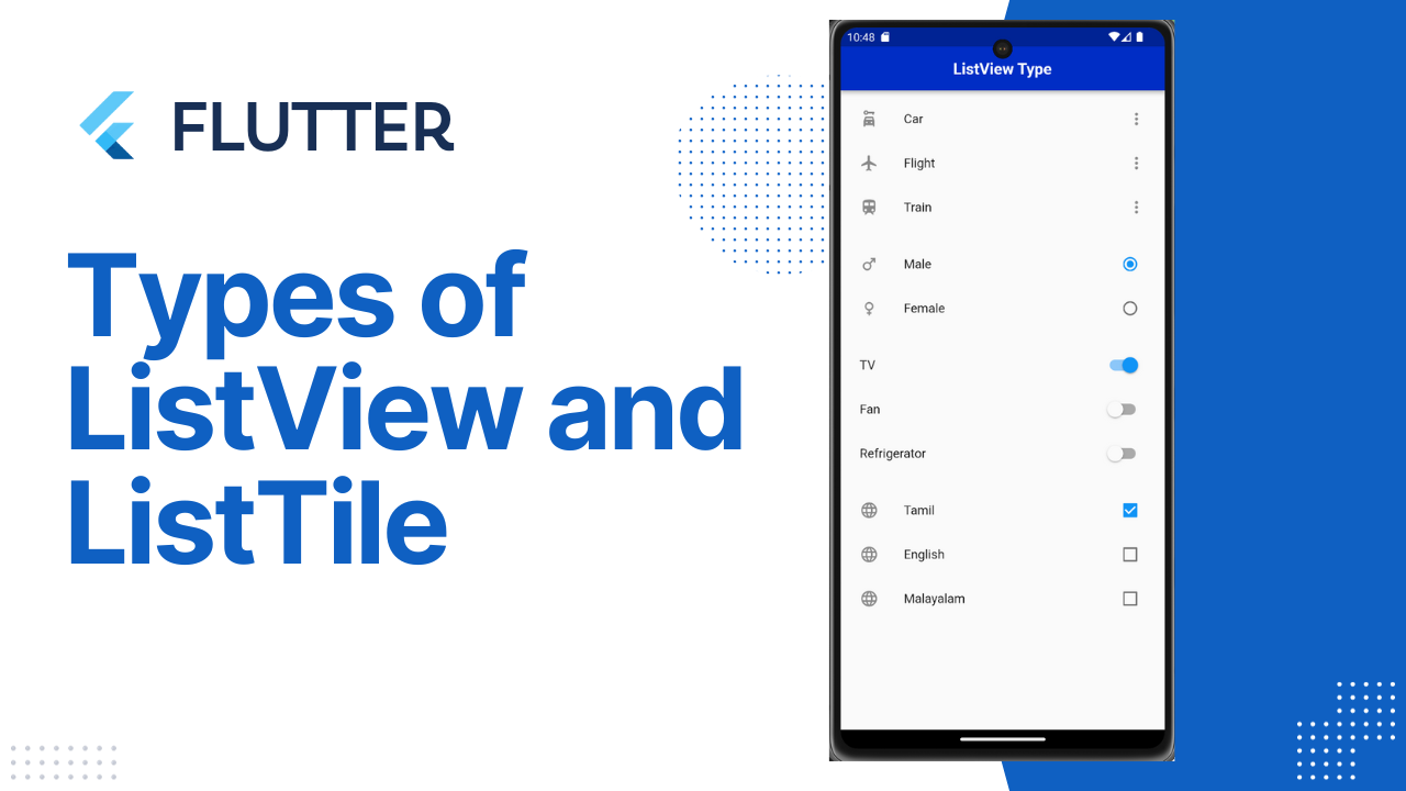
Listview and ListTile in Flutter
Listview and ListTile in Flutter : In Flutter, a ListView is a widget use to display a scrollable list of items. It’s a fundamental component for building dynamic and scrollable user interfaces. ListView is highly customizable and supports various types, each design to fulfill specific requirements.
Here are the different types of ListView in Flutter:
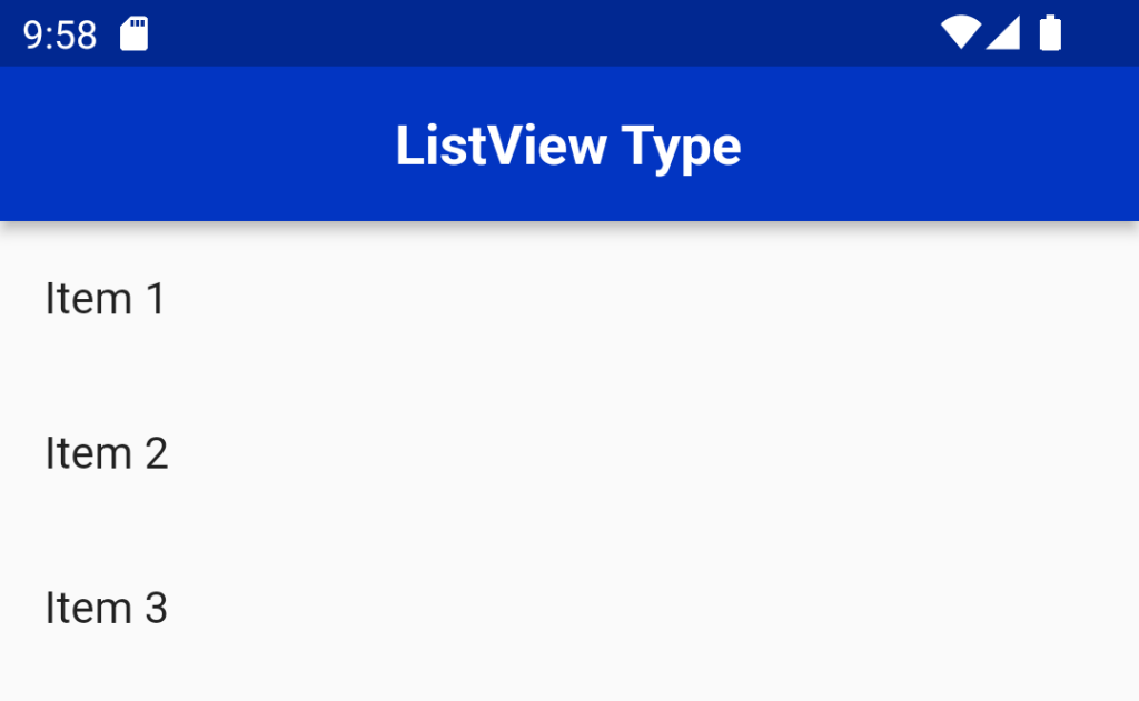
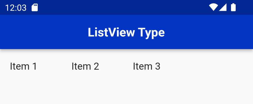
ListView:
The basic ListView displays a list of widgets in a single column, vertically scrolling if necessary.
ListView(
  children: <Widget>[
    ListTile(title: Text('Item 1')),
    ListTile(title: Text('Item 2')),
    ListTile(title: Text('Item 3')),
  ],
)
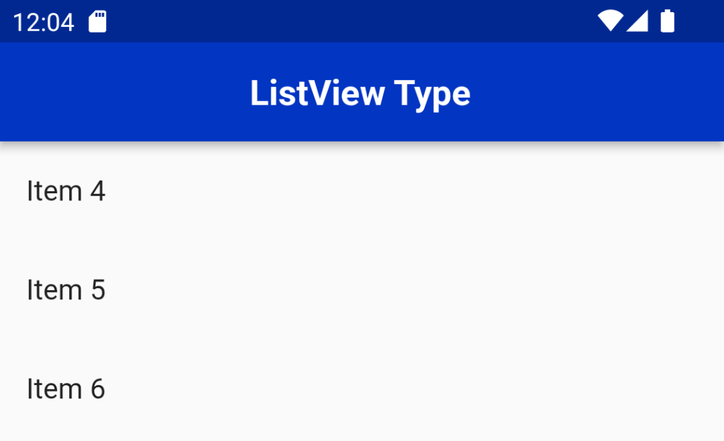
ListView.builder:
This type of ListView is use when you have a large or infinite list of items. It lazily constructs the widgets on-demand as they become visible on the screen, optimizing performance and memory usage.
List<String> items = ['Item 3', 'Item 1', 'Item 2','Item 3','Item 4'];

ListView.builder(
  itemCount: items.length,
  itemBuilder: (context, index) {
    return ListTile(title: Text(items[index]));
  },
)
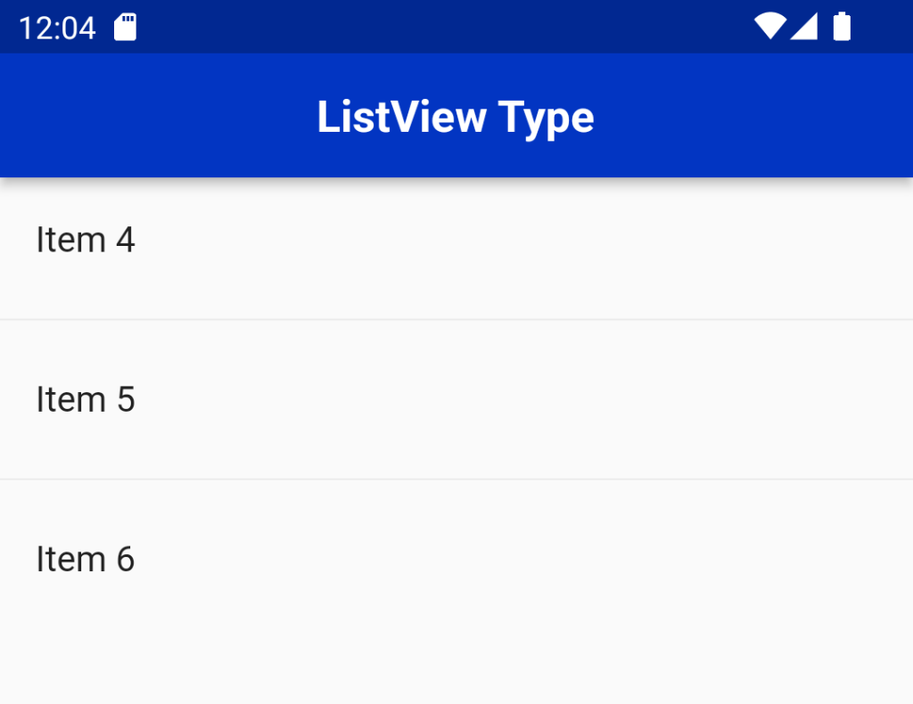
ListView.separated:
It is Similar to ListView.builder, this type allows you to build a list with separators between items.
List<String> items = ['Item 3', 'Item 1', 'Item 2','Item 3','Item 4'];

ListView.separated(
  itemCount: items.length,
  separatorBuilder: (context, index) => Divider(),
  itemBuilder: (context, index) {
    return ListTile(title: Text(items[index]));
  },
)
ListView.custom:
The ListView.custom gives you complete control over the list by providing custom delegates. It allows you to specify your own SliverChildDelegate to define the list’s children and their layout.
List<String> items = ['Item 3', 'Item 1', 'Item 2','Item 3','Item 4'];

ListView.custom(
  childrenDelegate: SliverChildBuilderDelegate(
    (context, index) {
      return ListTile(title: Text(items[index]));
    },
    childCount: items.length,
  ),
)
ListView.horizontal:
While most ListView types are vertically oriented, ListView.horizontal enables you to create a horizontally scrolling list of items.
These are some ways to make the most of ListView in Flutter, allowing you to create efficient, dynamic, and interactive lists in your applications.
ListView(
  scrollDirection: Axis.horizontal,
  children: <Widget>[
    ListTile(title: Text('Item 1')),
    ListTile(title: Text('Item 2')),
    ListTile(title: Text('Item 3')),

  ],
)
Error could be occured while your body widget have SingleChildScrollView.Its can be applicable while their is no ScrollView in the Body Widget.
ListTile
The ListTile widget in Flutter is a UI element that displays related information.
ListTile is divides into three sections; Start, Center, and End. The Start section contains the leading widget; the Center section includes the title and subtitle, and the End section contains the trailing widget.
ListView(
  children: const [
    ListTile(
      leading: Icon(Icons.car_rental),
      title: Text('Car'),
      trailing: Icon(Icons.more_vert),
    ),
    ListTile(
      leading: Icon(Icons.flight),
      title: Text('Flight'),
      trailing: Icon(Icons.more_vert),
    ),
    ListTile(
      leading: Icon(Icons.train),
      title: Text('Train'),
      trailing: Icon(Icons.more_vert),
    )
  ],
)
ListTile variations
There are also other types of ListTile which exist you to perform a specific action on it.
These are:
- CheckboxListTile
- RadioListTile
- SwitchListTile
CheckboxListTile
The CheckboxListTile widget is a combination of ListTile and Checkbox widgets.
You can use this widget to mark any item as complete.
for example: By default, the checkbox is displayed on the right side of the ListTile (for left-to-right language).
Code:Listview and ListTile in Flutter
class Language {
  String name;
  bool isChecked;
  Language(this.name, {this.isChecked = false});
}
final List<Language> languages = [Language('English'), Language('French'), Language('German')];


ListView.builder(
  itemCount: languages.length,
  itemBuilder: (context, index) {
    return CheckboxListTile(
      title: Text('${languages[index].name}'),
      value: languages[index].isChecked,
      onChanged: (bool? value) {
        setState(() {
          languages[index].isChecked = value!;
        });
      },
      secondary: const Icon(Icons.language),
    );
  },
)
To swap the secondary (leading) widget and checkbox, you can use the controlAffinity property and set it to ListTileControlAffinity.leading.
You can also change the shape of the checkbox by adding the checkboxShape parameter and setting it to RoundedRectangleBorder(borderRadius: BorderRadius.circular(20)).
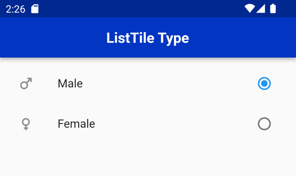
RadioListTile
Listview and ListTile in Flutter :The RadioListTile widget is a combination of ListTile and RadioButton widgets — this widget is used to select a single option from a list of items.
enum Gender { male, female }
Gender? gender = Gender.male;


ListView(
  children: [
    RadioListTile<Gender>(
      secondary: Icon(Icons.male),
      controlAffinity: ListTileControlAffinity.trailing,
      title: const Text('Male'),
      value: Gender.male,
      groupValue: gender,
      onChanged: (Gender? value) {
        setState(() {
          gender = value;
        });
      },
    ),
    RadioListTile<Gender>(
      secondary: Icon(Icons.female),
      controlAffinity: ListTileControlAffinity.trailing,
      title: const Text('Female'),
      value: Gender.female,
      groupValue: gender,
      onChanged: (Gender? value) {
        setState(() {
          gender = value;
        });
      },
    ),
  ],
)
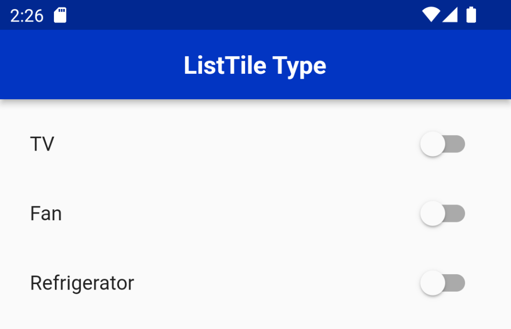
SwitchListTile
The SwitchListTile widget is a combination of the ListTile and Switch widgets.
You can use this widget to build the UI interaction that allows users to switch on or off app settings.
class Appliance {
  String name;
  bool isOn;
  Appliance(this.name, {this.isOn = false});
}
final List<Appliance> appliances = [
  Appliance('TV'),
  Appliance('Fan'),
  Appliance('Refrigerator'),
];


ListView.builder(
  itemCount: appliances.length,
  itemBuilder: (context, index) {
    return SwitchListTile(
      title: Text('${appliances[index].name}'),
      value: appliances[index].isOn,
      onChanged: (bool value) {
        setState(() {
          appliances[index].isOn = value;
        });
      },
    );
  },
)
For More :To know about Card Design in Flutter


Leave a Reply