
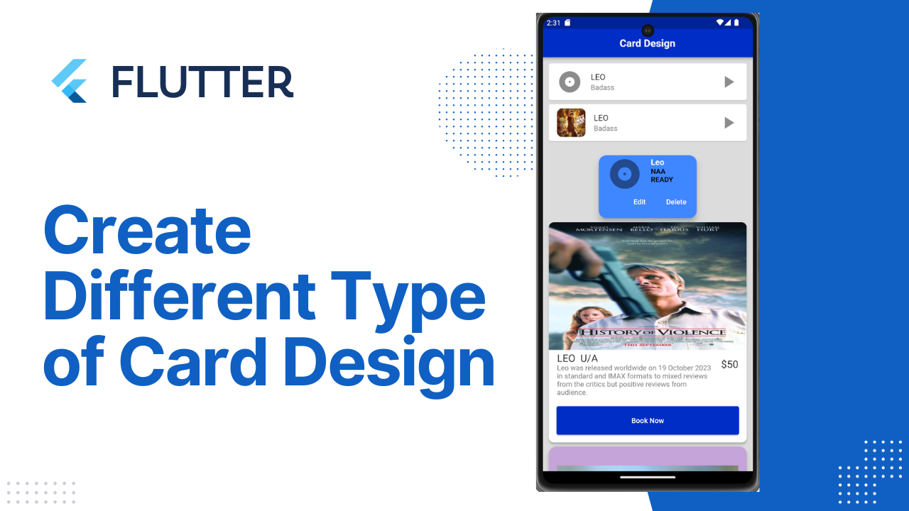
Card Design in Flutter:Card is a build-in widget in flutter which derives its design from Google’s Material Design Library. The functionality of this widget on screen is, that it is a bland space or panel with round corners and a slight elevation on the lower side. It comes with many properties like color, shape, shadow color, etc which lets developers customize it the way they like. Below we will go through all its properties and an example to see its implementation.
In this tutorial is about how to create Card widget in Flutter and how to customize it.
In Flutter, Card is a widget that is used to create a rectangular area with four rounded corners and a shadow effect on its edges. Card contains information such as album, geographic location, contact details, …
Properties of Card Widget
Whenever we construct a card class in Flutter, it has the following attributes:
borderOnForeground: This property requires a Boolean value as an input to decide whether to print the borders or not.
clipBehavior: This property helps clipping the content inside the card,
elevation: It takes the double value to decide the z-coordinate where the card should be positioned.
color: This property assigns a background color to the card.
shadowColor: It takes the color class as the object and assigns that color to the shadow. This color appears beneath the card and by default, the color is set to black.
margin: This property adds empty spaces around the card with the help of EdgeInsetsGeometry as the object.
shape: This property specifies the shape of the card. For example circular border, beveled border, or stadium border.
Below are some examples of how to use the widget along with the properties you can use to customize the visual of the widget.
Open the main.dart file located in the lib folder in a text editor or Visual Studio Code. Change the application logic to increase the counter by 2 instead of 1 if you click the button.
Create new file in lib folder by saving the file name as Login.dart
Open Login.dart file type the following.
- Create a new subclass of StatefulWidget and its associated State subclass.
Type stf or stl in the ide to auto-import all the code necessary to write a stateful or stateless widget. When the shortcut is selected, all the code appears with 5 cursors to name your new widget as you needed.
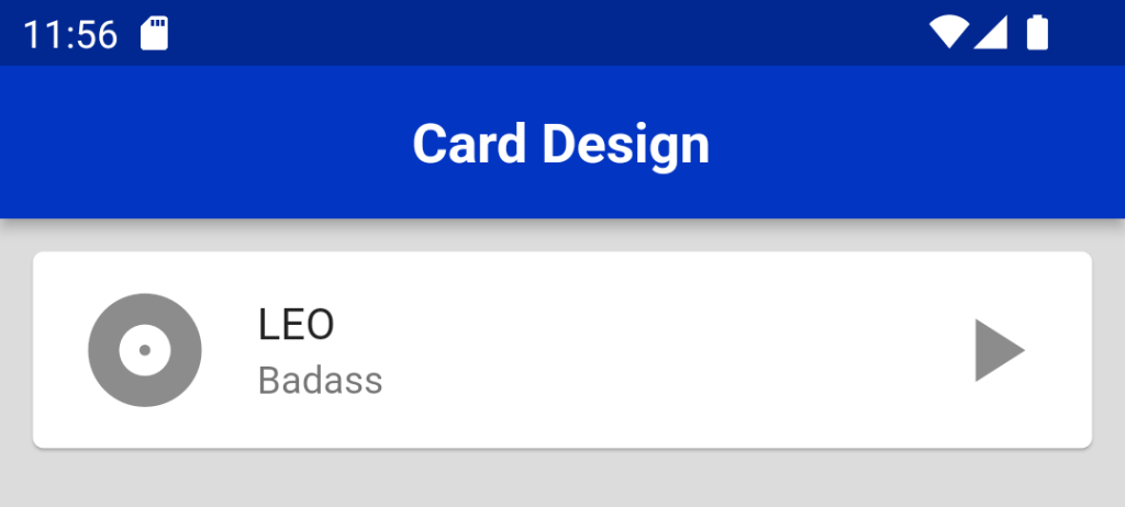
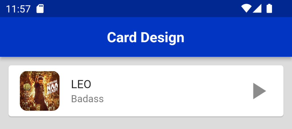
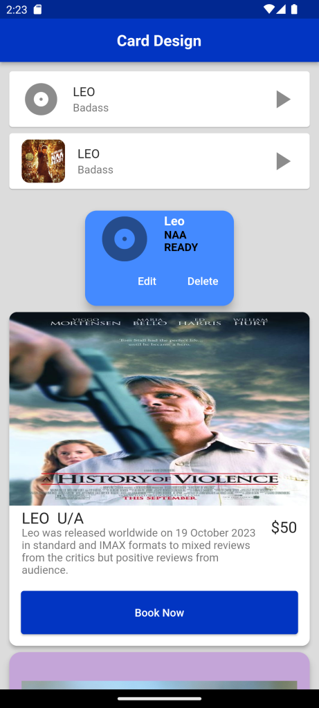
Creating a Card
Creating a Card is very easy. You only need to call the constructor and at least pass a Widget as child property to be displayed inside the Card.
Card(
  child: Column(
    mainAxisSize: MainAxisSize.min,
    children: <Widget>[
      const ListTile(
        trailing: Icon(Icons.play_arrow, size: 40),
        leading: Icon(Icons.album, size: 50),
        title: Text('LEO'),
        subtitle: Text('Badass'),
      ),
    ],
  ),
)
Customizing Card
Customizing Size
As it doesn’t provide option to adjust width or height, the easiest way to set the size is by wrapping it inside a Container or a SizedBox widget. Then, specify the desired width and height of the Container or SizedBox.
Container(
 width: 200,
 height: 200,
 child: Card(
   ...
 ),
)
Customizing Color
Use color property to set the color of the Card. You need to pass a Color, either by using predefined color or creating a custom color by defining the RGB values.
return Card(
   color: Colors.black,
// color: Color.fromARGB(50, 255, 100, 200),
   child: ...
);
Flutter uses pubspec.yaml file, located at the root of your project, to identify assets required for the app.
For Example:
flutter:

  assets:

    - assets/images/leo.jpeg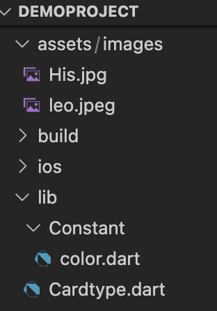
Create file in the name assets Where you can save the image assets needed for the application which includes images,icons,svg,font family.
- If you want to add other assets to your app, like fonts, it is preferred to make another subfolder named images.
- The path should look like assets/images/yourImage.
- Update the assets folder in pubspec.yaml file.
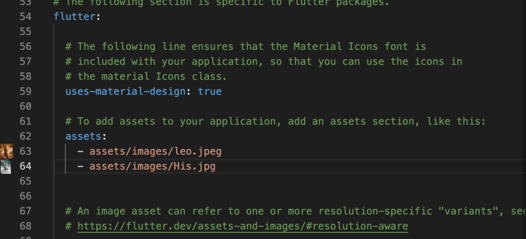
Image.asset('assets/images/leo.jpeg',) Card(
child: ListTile(
trailing: Icon( Icons.play_arrow, size: 40, ),
leading: ClipRRect(
borderRadius: BorderRadius.circular(10),
child: Image(image: AssetImage('assets/images/leo.jpeg')),
),
title: Text('LEO'),
subtitle: Text('Badass'),
),
), 
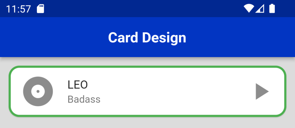
Customizing Border
To change the shape of the card we will use this property. By using shape property we can add border, change border color, make rounded corners, circular card etc.
By default, it uses RoundedRectangleBorder with a radius of 4.0. You can pass a custom ShapeBorder object. The example below uses RoundedRectangleBorder with a bigger radius of 15.0
return Card(
shape: RoundedRectangleBorder(
borderRadius: BorderRadius.circular(15.0),
),
child: ...
); Card(
shape: RoundedRectangleBorder(
side: BorderSide(color: Colors.green, width: 3),
borderRadius: BorderRadius.all(Radius.circular(15))),
shadowColor: Colors.green[100],
child: Column(
mainAxisSize: MainAxisSize.min,
children: <Widget>[
const ListTile(
trailing: Icon(Icons.play_arrow, size: 40),
leading: Icon(Icons.album, size: 50),
title: Text('LEO'),
subtitle: Text('Badass'),
),
],
),
), 
Customizing Shadow
If you want to control the shadow around the Card, you can set the elevation property. The bigger the value, the bigger the shadow distance.
return Card(
elevation: 10,
child: ...
); Container(
width: 200,
child: Card(
shape: RoundedRectangleBorder(
borderRadius: BorderRadius.circular(15.0),
),
color: Colors.blueAccent,
elevation: 10,
child: Column(
mainAxisSize: MainAxisSize.min,
children: <Widget>[
const ListTile(
leading: Icon(Icons.album, size: 70),
title: Text('Leo',
style: TextStyle(
color: Colors.white,
fontSize: 16,
fontWeight: FontWeight.bold)),
subtitle: Text('NAA READY',
style: TextStyle(
color: black, fontWeight: FontWeight.bold)),
),
ButtonBar(
children: <Widget>[
TextButton(
child: const Text('Edit', style: TextStyle(color: Colors.white)),
onPressed: () {},
),
TextButton(
child: const Text('Delete', style: TextStyle(color: Colors.white)),
onPressed: () {},
),
],
),
),
],
),
), 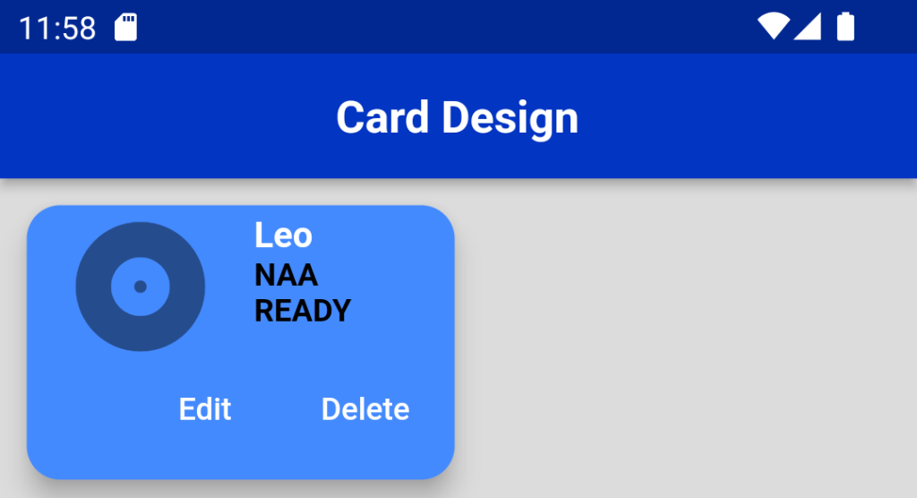
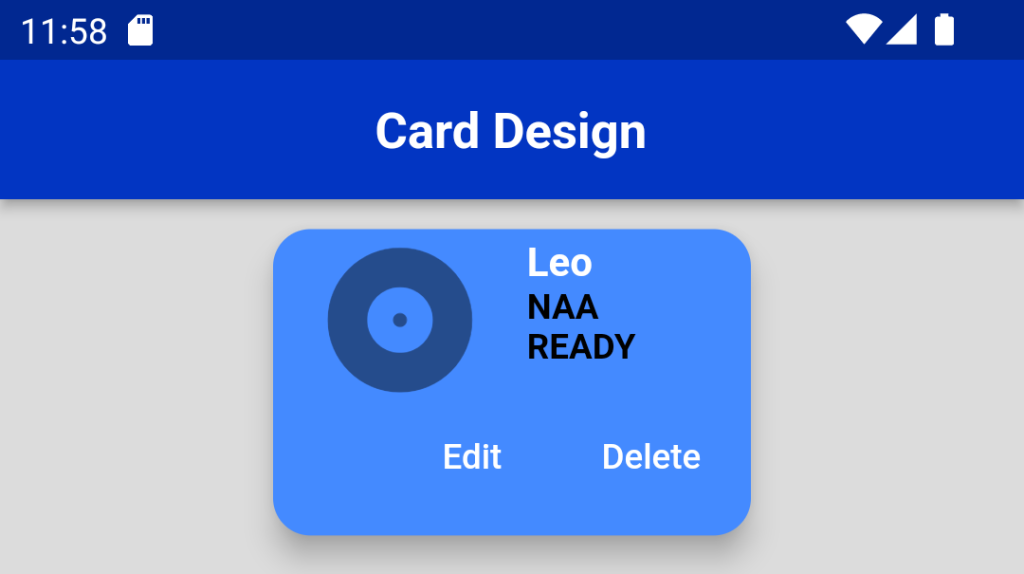
To Make it center use the Centre Widget.
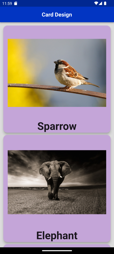
Card With Image and Text
we need to add some more data and design a better card. So let’s make a new Card widget function separate from the ListCardsScreen class and we will return the Card widget.
This function will accept the image link and title of the image
List<String> image = [
'https://cdn.pixabay.com/photo/2021/06/01/07/03/sparrow-6300790_960_720.jpg',
'https://cdn.pixabay.com/photo/2017/10/20/10/58/elephant-2870777_960_720.jpg',
'https://cdn.pixabay.com/photo/2014/09/08/17/32/humming-bird-439364_960_720.jpg',
'https://cdn.pixabay.com/photo/2018/05/03/22/34/lion-3372720_960_720.jpg'
];
List<String> title = [ 'Humming Bird', 'Lion','Sparrow', 'Elephant',];
ListView.builder(
physics: AlwaysScrollableScrollPhysics(),
shrinkWrap: true,
itemCount: image.length,
itemBuilder: (context, index) {
return Card(
color: Color.fromARGB(255, 196, 165, 216),
elevation: 8.0,
margin: EdgeInsets.all(4.0),
shape: RoundedRectangleBorder(
borderRadius: BorderRadius.circular(15)),
child: Column(
children: [
Padding(
padding: EdgeInsets.all(16.0),
child: Image.network(
image[index],
height: MediaQuery.of(context).size.width * (3 / 4),
width: MediaQuery.of(context).size.width,
),
),
Text(
title[index],
style: TextStyle(
fontSize: 38.0,
fontWeight: FontWeight.w700,
),
),
],
),
);
},
), 
Card With Multiple Task
In this example we add the images on the top by using ClipRRect ,after that we add the text using the ListTile,at the bottom we add the TextButton Widget.
Card(
shape: RoundedRectangleBorder(
borderRadius: BorderRadius.circular(10)),
elevation: 4,
child: Column(
children: [
ClipRRect(
borderRadius: const BorderRadius.only(
topLeft: Radius.circular(10),
topRight: Radius.circular(10),
),
child: Image.asset( 'assets/images/leo.jpeg'
height: 250,
width: MediaQuery.of(context).size.width,
fit: BoxFit.fill,
),
),
ListTile(
title: const Text( 'LEO U/A',
style: TextStyle(fontSize: 20),
),
trailing: const Text( '\$50',
style: TextStyle(fontSize: 20),
),
subtitle: Text( 'Leo was released worldwide on 19 October 2023 in standard and IMAX formats to mixed reviews from the critics but positive reviews from audience.'),
),
),
Padding(
padding: const EdgeInsets.all(15.0),
child: TextButton(
onPressed: () {},
style: TextButton.styleFrom(
backgroundColor: Colors.blue,
minimumSize:
Size(MediaQuery.of(context).size.width, 56)),
child: const Text(
'Book Now',
style: TextStyle(color: Colors.white),
),
),
)
],
),
),
Full Code:Card Design in Flutter
import 'package:demoproject/Constant/color.dart';
import 'package:flutter/material.dart';
import 'package:flutter/widgets.dart';
class CardType extends StatefulWidget {
CardType({Key? key}) : super(key: key);
@override
State<CardType> createState() => _CardTypeState();
}
class _CardTypeState extends State<CardType> {
List<String> image = [
'https://cdn.pixabay.com/photo/2014/09/08/17/32/humming-bird-439364_960_720.jpg',
'https://cdn.pixabay.com/photo/2018/05/03/22/34/lion-3372720_960_720.jpg',
'https://cdn.pixabay.com/photo/2021/06/01/07/03/sparrow-6300790_960_720.jpg',
'https://cdn.pixabay.com/photo/2017/10/20/10/58/elephant-2870777_960_720.jpg',
];
List<String> title = ['Sparrow', 'Elephant', 'Humming Bird', 'Lion'];
@override
Widget build(BuildContext context) {
return Scaffold(
backgroundColor: grey,
appBar: AppBar(
backgroundColor: Blue,
title: Center(
child: Text(
"Card Design",
style: TextStyle(fontSize: 20, fontWeight: FontWeight.bold),
)),
),
body: SingleChildScrollView(
child: Padding(
padding: const EdgeInsets.all(8.0),
child: Column(
children: [
Card(
child: Column(
mainAxisSize: MainAxisSize.min,
children: <Widget>[
const ListTile(
trailing: Icon(
Icons.play_arrow,
size: 40,
),
leading: Icon(Icons.album, size: 50),
title: Text('LEO'),
subtitle: Text('Badass'),
),
],
),
),
Card(
shape: RoundedRectangleBorder(
side: BorderSide(color: Colors.green, width: 3),
borderRadius: BorderRadius.all(Radius.circular(15))),
shadowColor: Colors.green[100],
child: Column(
mainAxisSize: MainAxisSize.min,
children: <Widget>[
const ListTile(
trailing: Icon(
Icons.play_arrow,
size: 40,
),
leading: Icon(Icons.album, size: 50),
title: Text('LEO'),
subtitle: Text('Badass'),
),
],
),
),
Card(
  child: ListTile(
     trailing: Icon( Icons.play_arrow, size: 40, ),
     leading: ClipRRect(
        borderRadius: BorderRadius.circular(10),
        child: Image(image: AssetImage('assets/images/leo.jpeg')),
        ),
     title: Text('LEO'),
     subtitle: Text('Badass'),
    ),
),
SizedBox(
height: 20,
),
Center(
child: Container(
width: 200,
child: Card(
shape: RoundedRectangleBorder(
borderRadius: BorderRadius.circular(15.0),
),
color: Colors.blueAccent,
elevation: 10,
child: Column(
mainAxisSize: MainAxisSize.min,
children: <Widget>[
const ListTile(
leading: Icon(Icons.album, size: 70),
title: Text('Leo',
style: TextStyle(
color: Colors.white,
fontSize: 16,
fontWeight: FontWeight.bold)),
subtitle: Text('NAA READY',
style: TextStyle(
color: black, fontWeight: FontWeight.bold)),
),
ButtonBar(
children: <Widget>[
TextButton(
child: const Text('Edit',
style: TextStyle(color: Colors.white)),
onPressed: () {},
),
TextButton(
child: const Text('Delete',
style: TextStyle(color: Colors.white)),
onPressed: () {},
),
],
),
],
),
),
),
),
Card(
shape: RoundedRectangleBorder(
borderRadius: BorderRadius.circular(10)),
elevation: 4,
child: Column(
children: [
ClipRRect(
borderRadius: const BorderRadius.only(
topLeft: Radius.circular(10),
topRight: Radius.circular(10),
),
child: Image.asset(
'assets/images/His.jpg',
height: 250,
width: MediaQuery.of(context).size.width,
fit: BoxFit.fill,
),
),
ListTile(
title: const Text(
'LEO U/A',
style: TextStyle(fontSize: 20),
),
trailing: const Text(
'\$50',
style: TextStyle(fontSize: 20),
),
subtitle: Text(
'Leo was released worldwide on 19 October 2023 in standard and IMAX formats to mixed reviews from the critics but positive reviews from audience.'),
),
Padding(
padding: const EdgeInsets.all(15.0),
child: ElevatedButton(
onPressed: () {},
style: TextButton.styleFrom(
backgroundColor: Blue,
minimumSize:
Size(MediaQuery.of(context).size.width, 56)),
child: const Text(
'Book Now',
style: TextStyle(color: Colors.white),
),
),
),
],
),
),
ListView.builder(
physics: AlwaysScrollableScrollPhysics(),
shrinkWrap: true,
itemCount: image.length,
itemBuilder: (context, index) {
return Card(
color: Color.fromARGB(255, 196, 165, 216),
elevation: 8.0,
margin: EdgeInsets.all(4.0),
shape: RoundedRectangleBorder(
borderRadius: BorderRadius.circular(15)),
child: Column(
children: [
Padding(
padding: EdgeInsets.all(16.0),
child: Image.network(
image[index],
height:
MediaQuery.of(context).size.width * (3 / 4),
width: MediaQuery.of(context).size.width,
),
),
Text(
title[index],
style: TextStyle(
fontSize: 38.0,
fontWeight: FontWeight.w700,
),
),
],
),
);
},
),
],
),
),
));
}
}
For More : To know about Custom Login Page in Flutter
Leave a Reply