
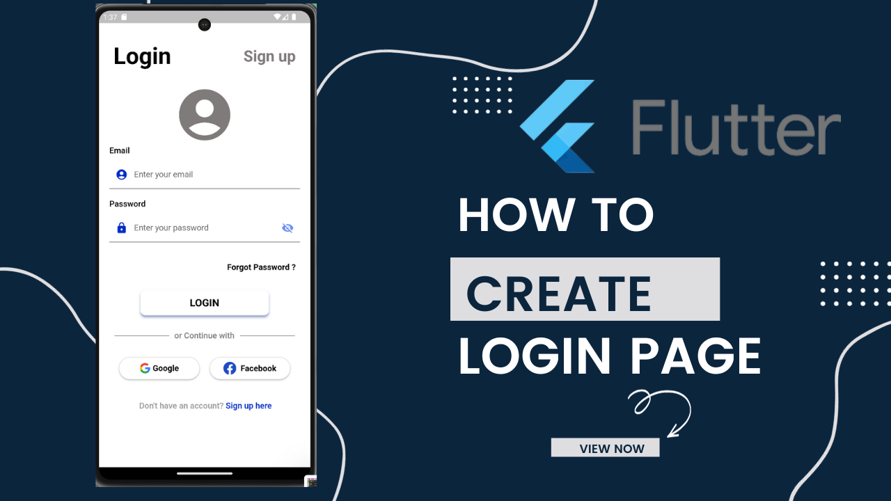
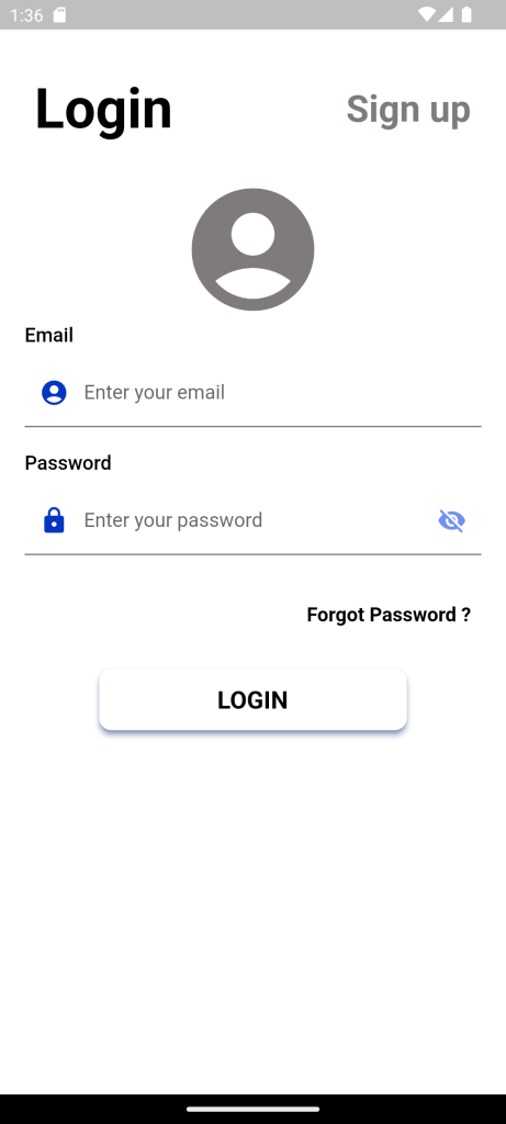
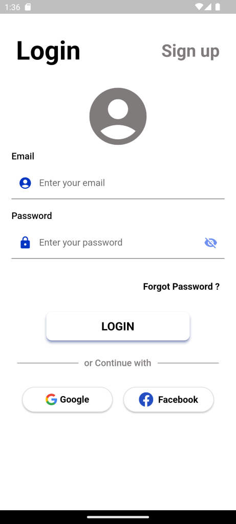
Custom Login Page in Flutter:To build a login page user interface. I have used the TextField widget, for user input as username and password. MaterialButton widget, to show action. Also, I have used Image to set logo for login page.
Open the main.dart file located in the lib folder in a text editor or Visual Studio Code. Change the application logic to increase the counter by 2 instead of 1 if you click the button.
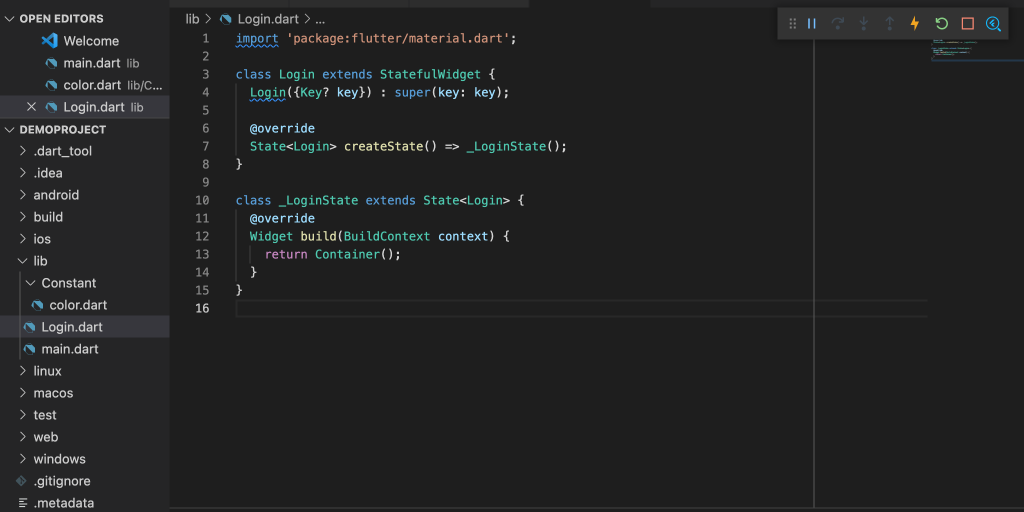
New file in lib folder by saving the file name as Login.dart
Login.dart file type the following.
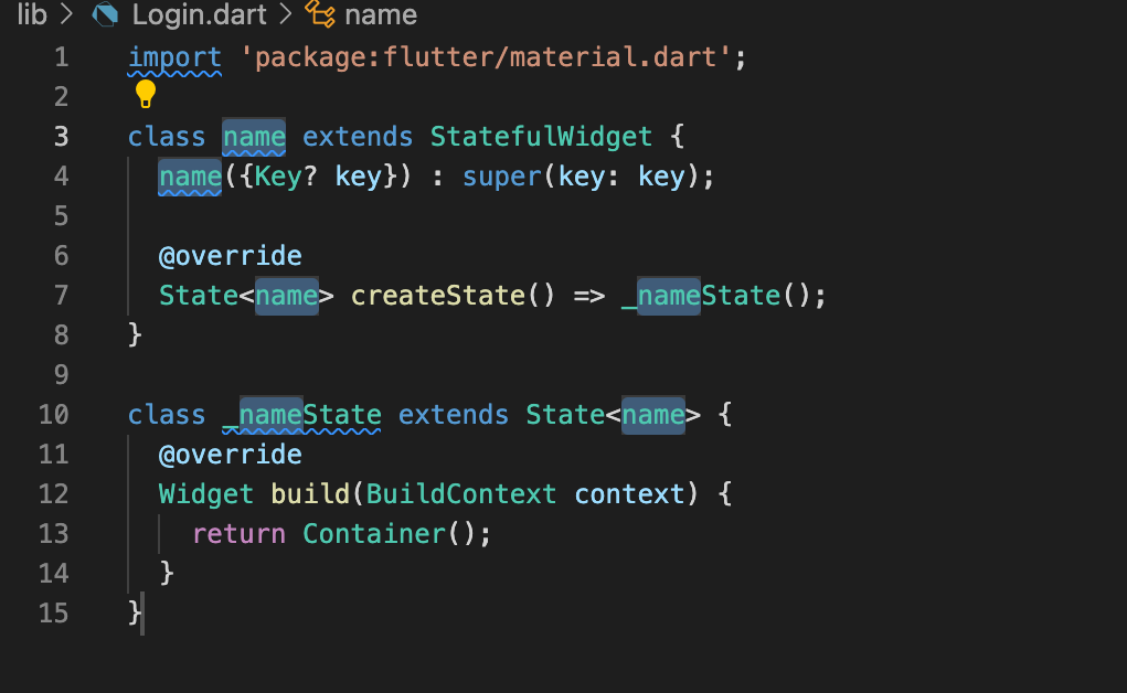
- Create a new subclass of StatefulWidget and its associated State subclass.
Type stf or stl in the ide to auto-import all the code necessary to write a stateful or stateless widget. When the shortcut is selected, all the code appears with 5 cursors to name your new widget as you needed.
class name extends StatefulWidget {
  name({Key? key}) : super(key: key);

  @override
  State<name> createState() => _nameState();
}

class _nameState extends State<name> {
  @override
  Widget build(BuildContext context) {
    return Container();
  }
}
In that inside the container we used to start coding for the login page.
Replace Container() into Scaffold()
The scaffold is used to expand and to fill the available space. That usually means that it will occupy its entire window or device screen.
class Login extends StatefulWidget {
  Login({Key? key}) : super(key: key);

  @override
  State<Login> createState() => _LoginState();
}

class _LoginState extends State<Login> {
  @override
  Widget build(BuildContext context) {
    return Scaffold();
  }
}
Background color:
backgroundColor: white,
The Color of the Material widget that underlies the entire Scaffold.
Body :
Its the primary content of the scaffold.
SingleChildScrollView ( ) :
A box in which a single widget can be scrolled.
SingleChildScrollView widget is useful when you have a single box that will normally be entirely visible.
Column( ) :
Column is to displays its children in a vertical array.
To expand to fill the available vertical space, wrap the child in an Expanded widget.
To arrange the content in center we use ,
example, the crossAxisAlignment is set to CrossAxisAlignment.start, so that the children are left-aligned. The mainAxisSize is set to MainAxisSize.start, so that the column shrinks to fit the children.
Children[ ]
To pass multiple widgets as children in a Column Widget, you need to add each widget as a separate child to the Column Widget. The Column Widget will then arrange the child widgets vertically, one below the other.
Row( )
Its create a horizontal array of children.
To expand to fill the available horizontal space, wrap the child in an Expanded widget.
Alignment Properties: Align content using mainAxisAlignment and crossAxisAlignment. Row’s mainAxis is horizontal and cross Axis to Row’s main Axis is vertical. We can align children horizontally using MainAxisAlignment and vertically using CrossAxisAlignment in that row.
Text()
The Text widget lets you create a run of styled text within your application.
Textstyle()
Textstyle describing how to format and paint text.
Text can styled using the property of color,fontSize,fontWeight,fontFamily.
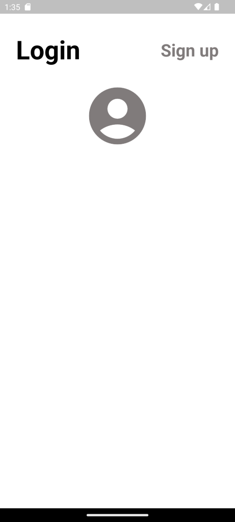
Text('Login',
  style: TextStyle(
    color: black,
    fontSize: 45,
    fontWeight: FontWeight.bold,
  ),
),
TextButton
Text Button is a Material Design’s button that comes without border or elevation change by default. Therefore, it relies on the position relative to other widgets. There are two required parameters. You have to pass a Widget as child, typically a Text widget. The other required parameter is onPressed, a callback which is called when the button is pressed.
TextButton(
    child: Text('Kums'),
    onPressed: () {
      print('Pressed');
    }
  )
Example:
TextButton(
child: Text('Login',
style: TextStyle(
color: black,
fontSize: 45,
fontWeight: FontWeight.bold,
),
),
onPress: () {
},
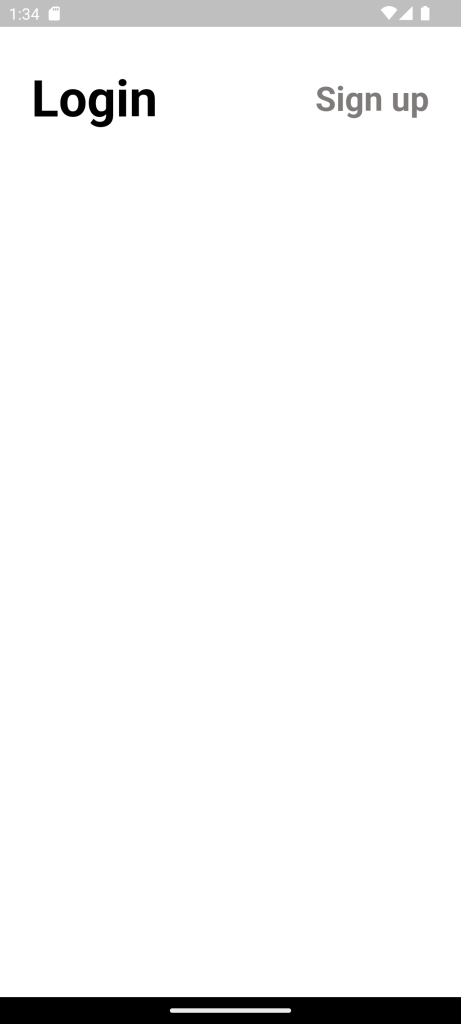
) Row(
mainAxisAlignment: MainAxisAlignment.spaceBetween,
children: [
TextButton(
onPressed: () {},
child: Text(
'Login',
style: TextStyle(
color: black,
fontSize: 45,
fontWeight: FontWeight.bold,
),
),
),
TextButton(
onPressed: () {},
child: Text(
'Sign up',
style: TextStyle(
color: greytext,
fontSize: 30,
fontWeight: FontWeight.bold,
),
),
)
],
),
Icon()
Its used to specify the icon name to display in the application. Generally, Flutter uses material design icons that are symbols for common actions and items.
Centre()
It’s the widget which can centre the element present in it.
Center(
child: Icon(
Icons.account_circle,
color: greytext,
size: 120,
),
),
BlankSpace
To make space between the two content use Sizedbox.
SizedBox(
height: 30,
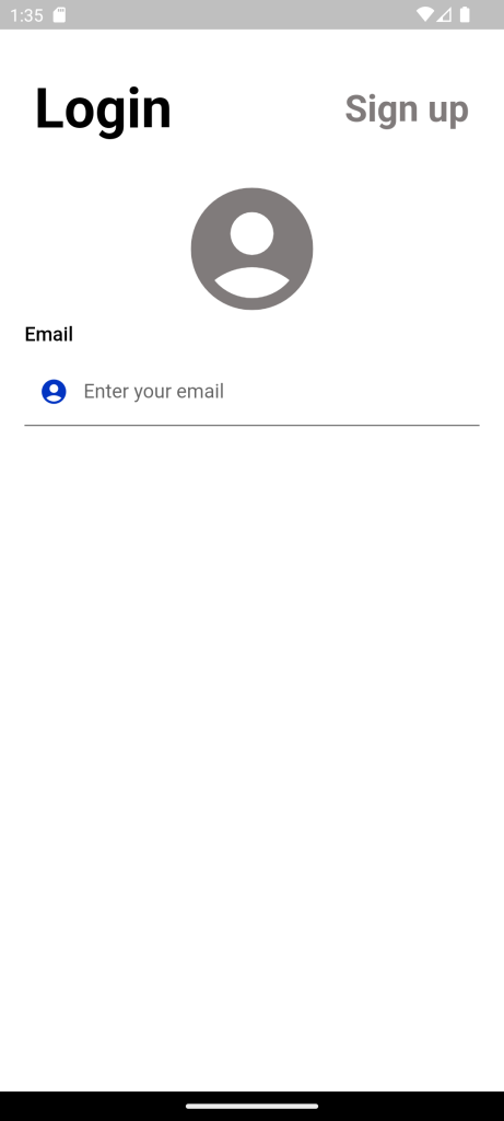
),Text()
The Text widget lets you create a run of styled text within your application.
Textstyle()
Textstyle describing how to format and paint text. Text can style using the property of color,fontSize,fontWeight,fontFamily.
Text(
'Email',
style: TextStyle(
fontSize: 16,
fontWeight: FontWeight.w500,
color: Colors.black),
),TextField( )
TextField is the most commonly use text input widget.By default, a TextField is decorated with an underline.
Add a label, icon, inline hint text, and error text by supplying an InputDecoration as the decoration property of the TextField.
TextField(
decoration: InputDecoration(
border: OutlineInputBorder(),
hintText: 'Enter your email',
),
), Custom Login Page in Flutter
TextFormField( )
TextFormField wraps a TextField and integrates it with the enclosing Form. It provides additional functionality, such as validation and integration with other FormField widgets.
InputDecoration( )
The border, labels, icons, and styles use to decorate a Material Design text field.
The TextField and InputDecorator classes use InputDecoration objects to describe their decoration.
- TextField, which is a text input widget that uses an InputDecoration.
- InputDecorator, which is a widget that draws an InputDecoration around an input child widget.
- Decoration and DecoratedBox, for drawing borders and backgrounds around a child widget.
TextEditingController()
Text field updates value and the controller notifies its users. Users can then read the text and selection properties to learn what the user has typed or how the selection has been update. if you modify the text or selection properties, the text field will be notify and will update itself appropriately.
TextFormField(
keyboardType: TextInputType.emailAddress,
validator: (String? value) {
if (value!.isEmpty) {
return "Please enter email";
}
return null;
},
controller: email,
autocorrect: true,
decoration: InputDecoration(
border: UnderlineInputBorder()
labelText: 'Enter your email',
contentPadding:
const EdgeInsets.only(left: 24, top: 14, bottom: 13),
filled: true,
fillColor: Colors.white,
hintText: "Enter your email",
hintStyle: const TextStyle(
color: grey, fontFamily: 'Rubik', fontSize: 14),
prefixIcon: Icon(
Icons.account_circle,
color: Blue,
)),
),
Text()
The Text widget lets you create a run of styled text within your application.
Textstyle()
Textstyle describing how to format and paint text. Text can style using the property of color,fontSize,fontWeight,fontFamily.
Align
Align Widget is the widget that is use to align its child within itself and optionally sizes itself based on the child’s size.
The Align Widget is quite flexible and can change its size according to the size of its child.
Parameters: The different parameters are describe as follows:
- alignment(Alignment): This parameter asks for the alignment of the child widget.The default value is Alignment.center.
- bottomCenter
- bottomLeft
- bottomRight
- topLeft
- topCenter
- topRight
- center
- centerLeft
- centerRight
- child(widget): This takes the child widget which is to be align.
- heightFactor(double): It takes a double value and it is use to set the height of Align widget as the factor multiplies by child height. The default value is 1.0.
- widthFactor(double): It takes a double value and it is use to set the width of Align widget as the factor multiplies by child width. The default value is 1.0.
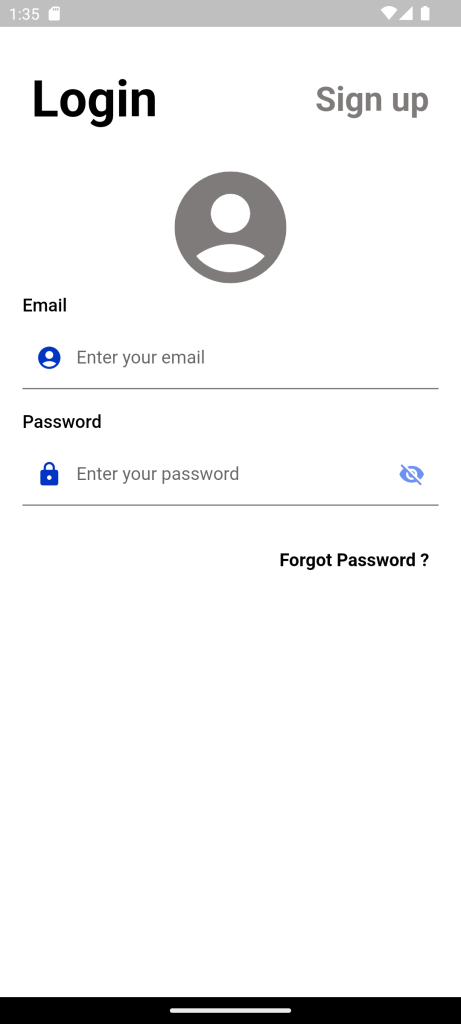
Align(
alignment: Alignment.topRight,
child: TextButton(
onPressed: () {},
child: Text(
'Forgot Password ?',
style: TextStyle(
color: black,
fontSize: 16,
fontWeight: FontWeight.bold,
),
),
),
),
ElevatedButton( )
An elevated button is a label child display on a Material widget whose Material elevation increases when the button is press. There are two require parameters. You have to pass a Widget as child, typically a Text widget. You’re also require to pass onPressed callback which is call when the user presses the button.
Sample syntax: Custom Login Page in Flutter
ElevatedButton(
child: Text('Click me'),
onPressed: () {
print('Pressed');
}
)ElevatedButton(
style: ElevatedButton.styleFrom(
shadowColor: Blue,
elevation: 4,
shape: RoundedRectangleBorder(
borderRadius: BorderRadius.circular(10)),
backgroundColor: Blue,
minimumSize: const Size.fromHeight(50),
),
onPressed: () {
setState(() {
if (formkey.currentState!.validate()) {
isloading = true;
print(isloading);
}
});
},
child: isloading == true
? Container(
width: 24,
height: 24,
padding: const EdgeInsets.all(2.0),
child: const CircularProgressIndicator(
color: Colors.white,
strokeWidth: 3,
),
)
: Text(
'LOGIN',
style: TextStyle(
fontSize:20,
fontWeight: FontWeight.w600,
),
),
),
Validation()
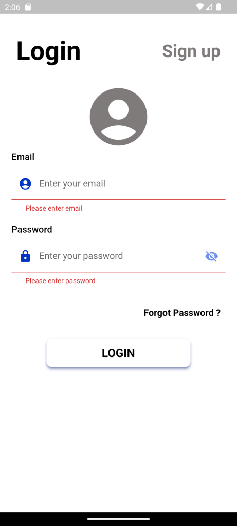
In APP Users to enter information into a text field. For example, you may require users to log in with an email address and password combination.
To make secure and easy to use, check whether the information the user has provided is valid or not. If the user has correctly filled out the information in the form, process the information. If the user submits incorrect information, display a friendly error message letting them know what went wrong.
Follow the steps Whether its Validate or not
- Create a Form with a GlobalKey.
- Add a TextFormFiled with validation logic.
- Create a button to validate and submit the form.
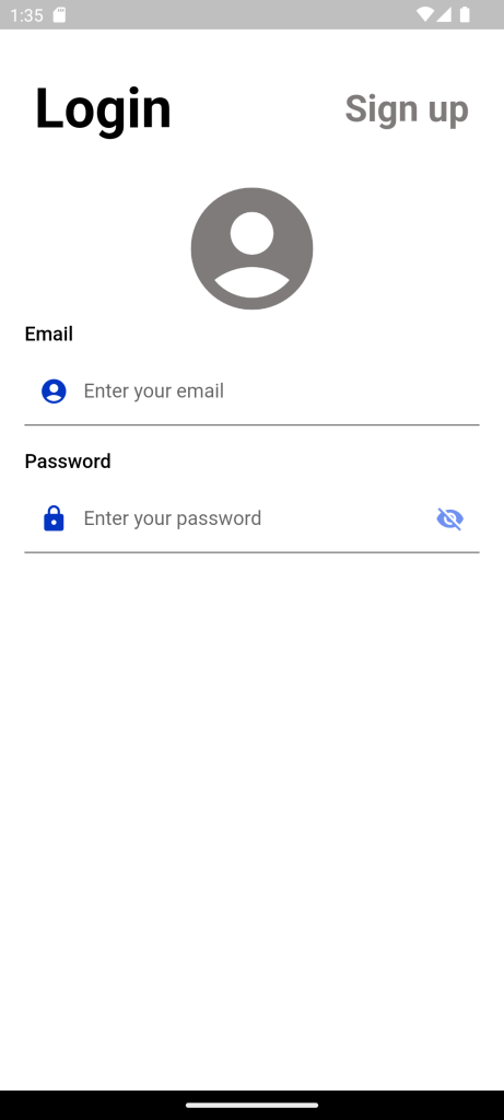
validator: (String? value) {
if (value!.isEmpty) {
return "Please enter username";
}
return null;
},
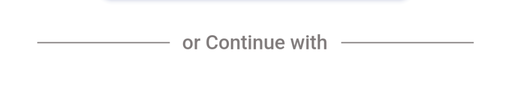
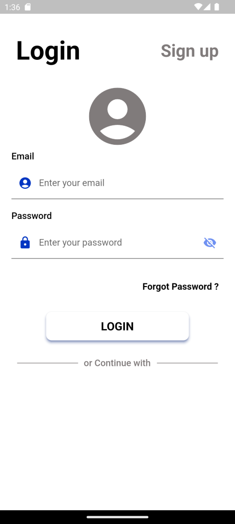
Divider
The Divider widget in Flutter is a horizontal line commonly use to separate sections or elements of a screen visually, providing a clear visual distinction. It can use to separate text, images, or other widgets.
Syntax:
Container(
child: Column(
children: [
Text("Text above Divider"),
Divider(),
Text("Text Below Divider"),
],
),
),Example
Divider(
indent: 10.0,
endIndent: 10.0,
thickness: 1,
color: greytext,
) Row(children: const <Widget>[
Expanded(
child: Divider(
indent: 10.0,
endIndent: 10.0,
thickness: 1,
color: greytext,
)),
Text(
'or Continue with',
style: TextStyle(
color: greytext,
fontSize: 16,
fontWeight: FontWeight.w500),
),
Expanded(
child: Divider(
indent: 10.0,
endIndent: 10.0,
thickness: 1,
color: greytext,
)),
]),
Flutter uses pubspec.yaml file, located at the root of your project, to identify assets required for the app.
If you save the pubspec.yaml file with the above lines of code it helpful to use the images that whatever images you save in assets file
For Example:
flutter:
assets:
- assets/images/
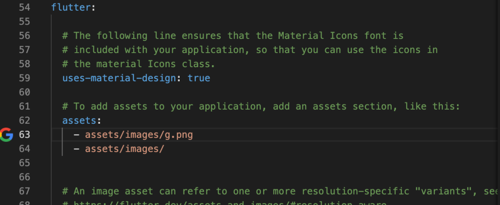
Uncommand the lines and edit what name you have given to the folder of images you save.
For example,see following codes sippets.
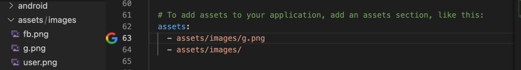
Create file in the name assets Where you can save the image assets need for the application which includes images,icons,svg,font family.
- If you want to add other assets to your app, like fonts, it is preferred to make another subfolder named images.
- The path should look like assets/images/yourImage.
- Update the assets folder in pubspec.yaml file.
Image.asset(‘assets/images/g.png’,)
Image.asset('assets/images/g.png',
height: 20,
)
Elevation button with Image and Text
ElevatedButton(
style: ElevatedButton.styleFrom(
shape: RoundedRectangleBorder(
borderRadius: BorderRadius.circular(22),
),
side: const BorderSide(
style: BorderStyle.solid,
color: grey,
width: 1),
backgroundColor: white,
foregroundColor: black,
fixedSize: const Size(158, 44),
),
onPressed: () {},
child: Row(
mainAxisAlignment: MainAxisAlignment.center,
children: [
Image.asset(
'assets/images/g.png',
height: 20,
),
const SizedBox(
width: 5,
),
const Text("Google",
style: TextStyle(
fontWeight: FontWeight.w700,
fontSize: 16))
],
)),
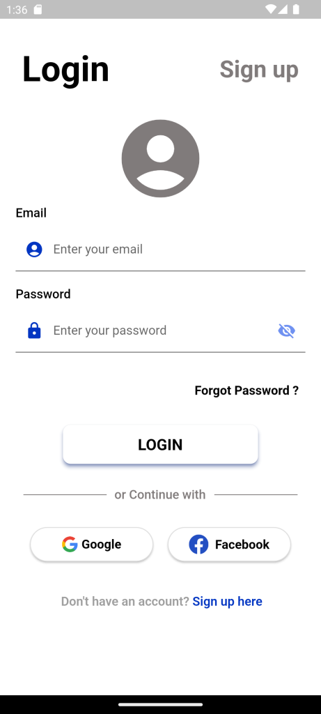
RichText
RichText widget is use to display text that uses various different styles. The displayed text is described using a tree of TextSpan objects, each of which has its own associated style that is used for that subtree. Depending on the layout constraints the text might break across multiple lines or might all be displayed on the same line.
RichText(
text: const TextSpan(
text: " Don't have an account?",
style: TextStyle(
color: Colors.grey,
fontWeight: FontWeight.w600,
fontSize: 16,
),
children: [
TextSpan(
text: ' Sign up here',
style: TextStyle(
color: Blue,
fontWeight: FontWeight.w600,
fontSize: 16,
fontStyle: FontStyle.normal),
)
]
),
),
Full Code:Custom Login Page in Flutter
import 'package:demoproject/Constant/color.dart';
import 'package:flutter/material.dart';
class Login extends StatefulWidget {
Login({Key? key}) : super(key: key);
@override
State<Login> createState() => _LoginState();
}
class _LoginState extends State<Login> {
bool isloading = false;
@override
void dispose() {
super.dispose();
}
final GlobalKey<FormState> formkey = GlobalKey<FormState>();
bool _passVisibility = true;
bool isEmailCorrect = false;
TextEditingController email = TextEditingController();
TextEditingController pass = TextEditingController();
@override
Widget build(BuildContext context) {
return Scaffold(
backgroundColor: white,
body: SingleChildScrollView(
child: Form(
key: formkey,
child: SafeArea(
child: Container(
margin: EdgeInsets.only(top: 30),
child: Padding(
padding: const EdgeInsets.only(left: 20, right: 20),
child: Column(
crossAxisAlignment: CrossAxisAlignment.start,
children: [
 Row(
   mainAxisAlignment: MainAxisAlignment.spaceBetween,
   children: [
     TextButton(
       onPressed: () {},
       child: Text(
        'Login',
        style: TextStyle(
         color: black,
         fontSize: 45,
         fontWeight: FontWeight.bold,
         ),
       ),
     ),
     TextButton(
       onPressed: () {},
       child: Text(
         'Sign up',
         style: TextStyle(
          color: greytext,
          fontSize: 30,
          fontWeight: FontWeight.bold,
        ),
      ),
    )
  ],
),
SizedBox(
height: 20,
),
Center(
  child: Icon(
    Icons.account_circle,
    color: greytext,
    size: 120,
  ),
),
Text(
'Email',
style: TextStyle(
fontSize: 16,
fontWeight: FontWeight.w500,
color: Colors.black),
),
SizedBox(
height: 10,
),
TextFormField(
keyboardType: TextInputType.emailAddress,
validator: (String? value) {
if (value!.isEmpty) {
return "Please enter email";
}
return null;
},
onChanged: (value) {
setState(() {
isEmailCorrect = !(!RegExp(
r"^[a-zA-Z0-9.a-zA-Z0-9.!#$%&'*+-/=?^_`{|}~]+@[a-zA-Z0-9]+\.[a-zA-Z]+")
.hasMatch(value));
});
},
controller: email,
autocorrect: true,
decoration: const InputDecoration(
border: UnderlineInputBorder(),
labelText: 'Enter your email',
contentPadding: const EdgeInsets.only(
left: 24, top: 10, bottom: 10),
filled: true,
fillColor: Colors.white,
hintText: "Enter your Email",
hintStyle: const TextStyle(color: grey, fontSize: 14),
prefixIcon: Icon(
Icons.account_circle,
color: Blue,
),
),
),
SizedBox(
height: 20,
),
Text(
'Password',
style: TextStyle(
fontSize: 16,
fontWeight: FontWeight.w500,
color: Colors.black),
),
SizedBox(
height: 10,
),
TextFormField(
validator: (String? value) {
if (value!.isEmpty) {
return "Please enter password";
}
return null;
},
controller: pass,
autocorrect: true,
obscureText: _passVisibility,
decoration: InputDecoration(
border: UnderlineInputBorder(),
labelText: 'Enter your password',
contentPadding: const EdgeInsets.only(
left: 24, top: 10, bottom: 10),
filled: true,
fillColor: Colors.white,
hintText: "Enter your password",
hintStyle: const TextStyle(color: grey, fontSize: 14),
prefixIcon: Icon(
Icons.lock_rounded,
color: Blue,
),
suffixIcon: IconButton(
color: grey,
icon: _passVisibility
? Icon(
Icons.visibility_off,
color: LiteBlue,
)
: Icon(
Icons.visibility,
color: Blue,
),
onPressed: () {
_passVisibility = !_passVisibility;
setState(() {});
},
),
),
),
SizedBox(height: 25),
Align(
alignment: Alignment.topRight,
child: TextButton(
onPressed: () {},
child: Text(
'Forgot Password ?',
style: TextStyle(
color: black,
fontSize: 16,
fontWeight: FontWeight.bold,
),
)),
),
SizedBox(height: 20),
Center(
child: SizedBox(
width: 250,
child: ElevatedButton(
style: ElevatedButton.styleFrom(
shadowColor: Blue,
elevation: 4,
shape: RoundedRectangleBorder(
borderRadius: BorderRadius.circular(10)),
backgroundColor: white,
minimumSize: const Size.fromHeight(50),
),
onPressed: () {
setState(() {
if (formkey.currentState!.validate()) {
isloading = true;
print(isloading);
}
});
},
child: Text(
'LOGIN',
style: TextStyle(
color: black,
fontSize: 20,
fontWeight: FontWeight.bold,
),
),
),
),
),
SizedBox(
 height: 30,
),
 Row(children: const <Widget>[
   Expanded(
       child: Divider(
     indent: 10.0,
     endIndent: 10.0,
     thickness: 1,
     color: greytext,
   )),
   Text(
     'or Continue with',
     style: TextStyle(
       color: greytext,
       fontSize: 16,
       fontWeight: FontWeight.w500),
   ),
   Expanded(
       child: Divider(
     indent: 10.0,
     endIndent: 10.0,
     thickness: 1,
     color: greytext,
   )),
 ]),
const SizedBox(
height: 30,
),
Row(
mainAxisAlignment: MainAxisAlignment.spaceEvenly,
children: [
ElevatedButton(
    style: ElevatedButton.styleFrom(
      shape: RoundedRectangleBorder(
        borderRadius: BorderRadius.circular(22),
      ),
      side: const BorderSide(
          style: BorderStyle.solid,
          color: grey,
          width: 1),
      backgroundColor: white,
      foregroundColor: black,
      fixedSize: const Size(158, 44),
    ),
    onPressed: () {},
    child: Row(
      mainAxisAlignment: MainAxisAlignment.center,
      children: [
        Image.asset(
          'assets/images/g.png',
          height: 20,
        ),
        const SizedBox(
          width: 5,
        ),
        const Text("Google",
            style: TextStyle(
               fontWeight: FontWeight.w700,
               fontSize: 16))
      ],
)),
ElevatedButton(
style: ElevatedButton.styleFrom(
shape: RoundedRectangleBorder(
borderRadius: BorderRadius.circular(22),
),
side: const BorderSide(
style: BorderStyle.solid,
color: grey,
width: 1),
backgroundColor: white,
foregroundColor: black,
fixedSize: const Size(158, 44),
),
onPressed: () {},
child: Row(
mainAxisAlignment: MainAxisAlignment.center,
children: [
Image.asset(
'assets/images/fb.png',
height: 25,
),
const SizedBox(
width: 8.5,
),
const Padding(
padding: EdgeInsets.only(top: 13, bottom: 12),
child: Text("Facebook",
style: TextStyle(
fontWeight: FontWeight.w700,
fontSize: 16)),
)
],
)),
],
),
const SizedBox(
height: 25,
),
TextButton(
onPressed: () {},
child: Center(
child: RichText(
text: const TextSpan(
text: " Don't have an account?",
style: TextStyle(
color: Colors.grey,
fontWeight: FontWeight.w600,
fontSize: 16,
),
children: [
TextSpan(
text: ' Sign up here',
style: TextStyle(
color: Blue,
fontWeight: FontWeight.w600,
fontSize: 16,
fontStyle: FontStyle.normal),
)
]),
),
))
],
),
),
),
),
)));
}
}
For More: To know about Drawer Navigation in Flutter
Leave a Reply