
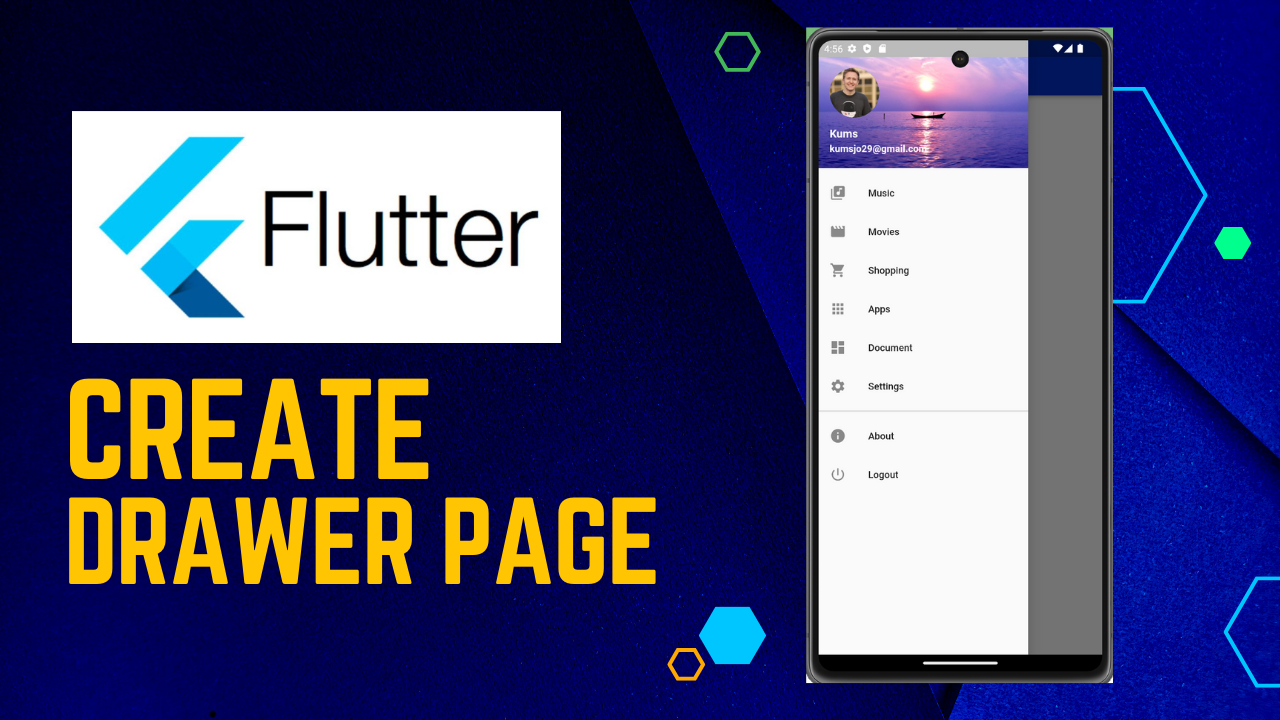
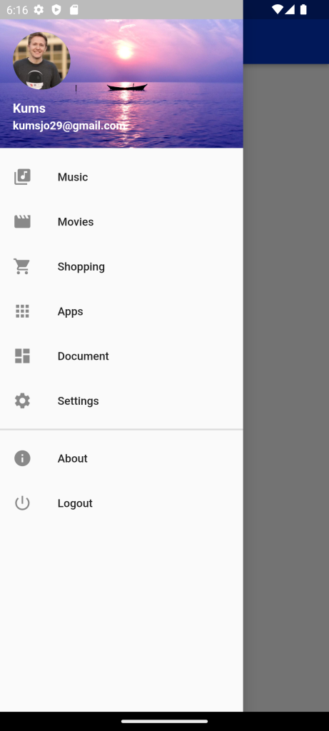
Drawer Navigation in Flutter :Drawer widget is used to provide access to different destinations and functionalities provided in your application. It is represented by three horizontal parallel lines on the upper end of the scaffold. It has a horizontal movement from the edge of the Scaffold that navigates the link to different routes in the flutter app
Drawer Navigation in Flutter:In the build method of this widget, we will return the Flutter Drawer widget. Drawer can be any widget, but it is often best to use the Drawer widget from a Material Library that follows the Material Design specification.
We will wrap the Drawer widget in a Theme widget to change the style for the entire drawer. Specifically, we change the canvasColor, that is a drawer’s background color, and we set its value to blue. Rather than overriding everything, it often makes sense to extend the parent theme. And we can handle this by using the copyWith() method.
In the Drawer’s hierarchy of widgets, we add a ListView widget to the child attribute of the Drawer. We could define another way to organize additional item widgets into Drawer, but ListView is useful because it allows users to scroll through Drawer if the content takes up more space than the screen supports.
We will add the Drawer header and ListTile widget to the ListView.
And we set Drawer’s padding to zero to remove any redundant space from Drawer.
In the build method, in the Scaffold widget we define a new attribute – drawer and we set its value to a new widget – Drawer.
We need to create this widget first. So we add a new drawer.dart file to the components folder. And we will create a ShopDrawer in it that will inherit from the Stateless Widget.
Drawer Header
To create a Drawer header, we define the private method _buildDrawerHeader, where we set BuildContext as a parameter. This method returns the UserAccountsDrawerHeader widget.
UserAccountsDrawerHeader
We will define several attributes for the UserAccountsDrawerHeader widget.
accountName
The first attribute will be accountName, where we define the name of our store: ‘Himdeve Fashion’. We’ll wrap it with the Text widget and set a text background color to black.
accountName: Text(
	'Kums',
	style: TextStyle(backgroundColor: Colors.black),
),
accountEmail
We will also define another attribute accountEmail and we set its value to ‘kumsxyz20@gmail.com’.
accountEmail: Text(
	'kumsxyz20@gmail.com',
	style: TextStyle(backgroundColor: Colors.black),
),
UserAccountsDrawerHeader – decoration
The last attribute we define for UserAccountsDrawerHeader will be a decoration attribute that will represent the background of the drawer’s header. We put in it a BoxDecoration widget that has an image attribute where we create a DecorationImage widget. The DecorationImage widget also has an image attribute. In this attribute we insert the NetworkImage widget with the url image for our header. To adjust the layout of the image for the entire header area, we define the fit attribute to: BoxFit.cover.
decoration: BoxDecoration(
  image: DecorationImage(
    fit: BoxFit.cover,
    image: NetworkImage(
    	'https://himdeve.eu/wp-content/uploads/2019/04/himdeve_beach.jpg'),
  ),
),
AlertDialog
For AlertDialog set the title attribute, where we add a Text widget with the name of our store ‘Himdeve Fashion’. Then the content attribute, where we add a basic info about the store. Finally, we define the actions attribute where we add the FlatButton widget. To press this button, the following method is called:
When a user opens a dialog, Flutter adds the dialog to the navigation stack. Therefore, if we want to close it, we call the Navigator pop() method to jump out of the last navigator path.
Navigator.of(context).pop()CurrentAccountPicture
Another attribute will be currentAccountPicture, which represents either the user’s photo or, in our case, the logo of our store. We will return the GestureDetector to call this callback method.
CircleAvatar
The second attribute of the Gesture Detector is the child attribute, which represents the hierarchy of other widgets. In our case, we will define a CircleAvatar widget here to create a circle around our logo.
We set the backgroundColor attribute to black and we set also the backgroundImage attribute to which we insert a NetworkImage widget that displays an image of our logo from the Internet.
currentAccountPicture: CircleAvatar(
    backgroundImage: NetworkImage(
        "https://randomuser.me/api/portraits/men/28.jpg")),
   ),
ListTile
To add more items in the drawer, under the drawer header, we define the _buildPortfolioItem method with the BuildContext parameter, in where we return the ListTile widget.
ListTile is a single line of fixed height, which usually contains some text, as well as a leading or trailing icon.
In our case it will have the title attribute, where we set the name to ‘Music’.
title: Text('Music'),The attribute leading that represents the start-up icon and we set its value to the icon representing the music.
leading: Icon(Icons.library_music),First we call:
Navigator.of(context).pop();This command works just like with a dialog, so we jump out of the last path in the navigator, in our case from the drawer widget.
Basic navigation – Page Route
And then we call the command to switch the screens, in our case to switch to Music widget.
We will call Navigator again with a BuildContext and this time we use its push method, which has the Route parameter. This parameter represents the new screen of our app, in our case the PortfolioPage widget. Navigator adds this widget to the navigation stack using the push method.
What is important to note is that the call for a navigator pop command must be defined before switching the screen to another widget by the navigator push method. Otherwise we will get an exception because we are already in the context of another widget.
ListTile _buildPortfolioItem(BuildContext context) {
  return ListTile(
  title: Text('Portfolio'),
    leading: Icon(Icons.work),
    onTap: () {
      Navigator.of(context).pop();

      Navigator.of(context).push(
      	MaterialPageRoute(builder: (context) => MusicPage()),
      );
  	},
  );
}
Divider
The last method we create in Listview for Drawer will be Divider(). This method returns the Divider widget, which is a thin horizontal line with padding on the sides. We will separate the item with it. We set her color .
Divider(
   thickness: 2,
  ),
Full code : Drawer Navigation in Flutter
import 'package:demoproject/Constant/color.dart';
import 'package:flutter/material.dart';

class DrawerType extends StatefulWidget {
  @override
  _DrawerTypeState createState() => _DrawerTypeState();
}

class _DrawerTypeState extends State<DrawerType> {
  @override
  Widget build(BuildContext context) {
    return Scaffold(
      appBar: AppBar(
        backgroundColor: Blue,
        title: Text("Navigation Drawer"),
        titleSpacing: 2,
      ),
      drawer: new Drawer(
        child: new ListView(
          children: <Widget>[
            new UserAccountsDrawerHeader(
              accountName: new Text(
                "Kums",
                style: TextStyle(fontSize: 16, fontWeight: FontWeight.bold),
              ),
              accountEmail: new Text(
                "kumsjo29@gmail.com",
                style: TextStyle(fontSize: 14, fontWeight: FontWeight.w700),
              ),
              decoration: new BoxDecoration(
                image: new DecorationImage(
                  image: new ExactAssetImage('assets/images/banner1.png'),
                  fit: BoxFit.cover,
                ),
              ),
              currentAccountPicture: CircleAvatar(
                  backgroundImage: NetworkImage(
                      "https://randomuser.me/api/portraits/men/28.jpg")),
            ),
            new ListTile(
                leading: Icon(Icons.library_music),
                title: new Text("Music"),
                onTap: () {
                  Navigator.pop(context);
                }),
            new ListTile(
                leading: Icon(Icons.movie),
                title: new Text("Movies"),
                onTap: () {
                  Navigator.pop(context);
                }),
            new ListTile(
                leading: Icon(Icons.shopping_cart),
                title: new Text("Shopping"),
                onTap: () {
                  Navigator.pop(context);
                }),
            new ListTile(
                leading: Icon(Icons.apps),
                title: new Text("Apps"),
                onTap: () {
                  Navigator.pop(context);
                }),
            new ListTile(
                leading: Icon(Icons.dashboard),
                title: new Text("Document"),
                onTap: () {
                  Navigator.pop(context);
                }),
            new ListTile(
                leading: Icon(Icons.settings),
                title: new Text("Settings"),
                onTap: () {
                  Navigator.pop(context);
                }),
            new Divider(
              thickness: 2,
            ),
            new ListTile(
                leading: Icon(Icons.info),
                title: new Text("About"),
                onTap: () {
                  Navigator.pop(context);
                }),
            new ListTile(
                leading: Icon(Icons.power_settings_new),
                title: new Text("Logout"),
                onTap: () {
                  Navigator.pop(context);
                }),
          ],
        ),
      ),
    );
  }
}
For More : To know about Route Navigation in Flutter

Leave a Reply